18 Building forms with Tag Helpers
18 使用标记辅助对象构建表单
This chapter covers
本章涵盖
• Building forms easily with Tag Helpers
使用标签帮助程序轻松构建表单
• Generating URLs with the Anchor Tag Helper
使用锚点标签帮助程序生成 URL
• Using Tag Helpers to add functionality to Razor
使用标签帮助程序向 Razor 添加功能
In chapter 17 you learned about Razor templates and how to use them to generate the views for your application. By mixing HTML and C#, you can create dynamic applications that can display different data based on the request, the logged-in user, or any other data you can access.
在第 17 章中,您了解了 Razor 模板以及如何使用它们为应用程序生成视图。通过混合使用 HTML 和 C#,您可以创建动态应用程序,这些应用程序可以根据请求、登录用户或您可以访问的任何其他数据显示不同的数据。
Displaying dynamic data is an important aspect of many web applications, but it’s typically only half of the story. As well as needing to displaying data to the user, you often need the user to be able to submit data back to your application. You can use data to customize the view or to update the application model by saving it to a database, for example. For traditional web applications, this data is usually submitted using an HTML form.
显示动态数据是许多 Web 应用程序的一个重要方面,但通常只是其中的一半。除了需要向用户显示数据外,您还经常需要用户能够将数据提交回您的应用程序。例如,您可以使用 data 来自定义视图或通过将应用程序模型保存到数据库来更新应用程序模型。对于传统的 Web 应用程序,此数据通常使用 HTML 表单提交。
In chapter 16 you learned about model binding, which is how you accept the data sent by a user in a request and convert it to C# objects that you can use in your Razor Pages. You also learned about validation and how important it is to validate the data sent in a request. You used DataAnnotations attributes to define the rules associated with your models, as well as associated metadata like the display name for a property.
在第 16 章中,你了解了模型绑定,即如何接受用户在请求中发送的数据,并将其转换为可在 Razor Pages 中使用的 C# 对象。您还了解了验证以及验证请求中发送的数据的重要性。您使用 DataAnnotations 属性来定义与模型关联的规则,以及关联的元数据,例如属性的显示名称。
The final aspect we haven’t yet looked at is how to build the HTML forms that users use to send this data in a request. Forms are one of the key ways users will interact with your application in the browser, so it’s important they’re both correctly defined for your application and user-friendly. ASP.NET Core provides a feature to achieve this, called Tag Helpers.
我们还没有研究的最后一个方面是如何构建用户用来在请求中发送这些数据的 HTML 表单。表单是用户在浏览器中与您的应用程序交互的关键方式之一,因此它们必须为您的应用程序正确定义并且对用户友好。ASP.NET Core 提供了一项功能来实现此目的,称为 Tag Helpers。
Tag Helpers are additions to Razor syntax that you use to customize the HTML generated in your templates. Tag Helpers can be added to an otherwise-standard HTML element, such as an <input>, to customize its attributes based on your C# model, saving you from having to write boilerplate code. Tag Helpers can also be standalone elements and can be used to generate completely customized HTML.
标记帮助程序是 Razor 语法的新增功能,用于自定义模板中生成的 HTML。可以将标记帮助程序添加到其他标准的 HTML 元素(如 <input>)以基于 C# 模型自定义其属性,从而使您不必编写样板代码。标记帮助程序也可以是独立元素,可用于生成完全自定义的 HTML。
NOTE Remember that Razor, and therefore Tag Helpers, are for server-side HTML rendering. You can’t use Tag Helpers directly in frontend frameworks like Angular and React.
注意:请记住,Razor 以及标记帮助程序用于服务器端 HTML 呈现。你不能直接在 Angular 和 React 等前端框架中使用 Tag Helpers。
If you’ve used legacy (.NET Framework) ASP.NET before, Tag Helpers may sound reminiscent of HTML Helpers, which could also be used to generate HTML based on your C# classes. Tag Helpers are the logical successor to HTML Helpers, as they provide a more streamlined syntax than the previous, C#-focused helpers. HTML Helpers are still available in ASP.NET Core, so if you’re converting some old templates to ASP.NET Core, you can still use them. But if you’re writing new Razor templates, I recommend using only Tag Helpers, as they should cover everything you need. I don’t cover HTML Helpers in this book.
如果您以前使用过旧版 (.NET Framework) ASP.NET,则标记帮助程序听起来可能会让人想起 HTML 帮助程序,后者也可用于基于 C# 类生成 HTML。标记帮助程序是 HTML 帮助程序的逻辑继承程序,因为它们提供的语法比以前以 C# 为中心的帮助程序更简化。HTML 帮助程序在 ASP.NET Core 中仍然可用,因此,如果要将一些旧模板转换为 ASP.NET Core,您仍然可以使用它们。但是,如果您正在编写新的 Razor 模板,我建议仅使用 Tag Helpers,因为它们应该涵盖您需要的所有内容。在本书中,我不涉及 HTML Helpers。
In this chapter you’ll primarily learn how to use Tag Helpers when building forms. They simplify the process of generating correct element names and IDs so that model binding can occur seamlessly when the form is sent back to your application. To put them into context, you’re going to carry on building the currency converter application that you’ve seen in previous chapters. You’ll add the ability to submit currency exchange requests to it, validate the data, and redisplay errors on the form using Tag Helpers to do the legwork for you, as shown in figure 18.1.
在本章中,您将主要学习如何在构建表单时使用 Tag Helpers。它们简化了生成正确元素名称和 ID 的过程,以便在将表单发送回应用程序时可以无缝地进行模型绑定。为了将它们放在上下文中,您将继续构建您在前几章中看到的货币转换器应用程序。您将添加向其提交货币兑换请求、验证数据以及使用 Tag Helpers 在表单上重新显示错误的功能,以为您完成跑腿工作,如图 18.1 所示。
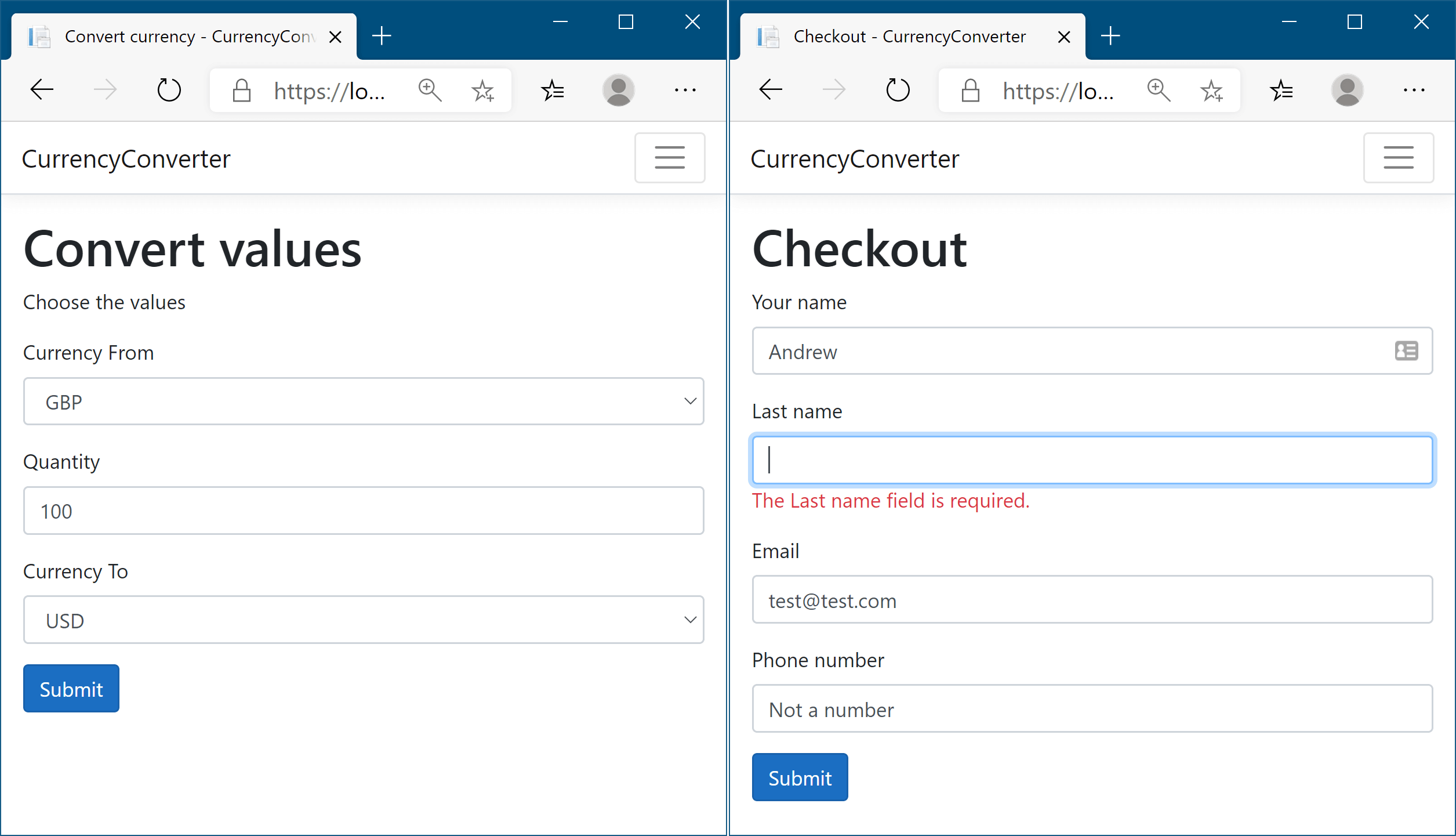
Figure 18.1 The currency converter application forms, built using Tag Helpers. The labels, drop-down lists, input elements, and validation messages are all generated using Tag Helpers.
图 18.1 使用 Tag Helper 构建的货币转换器应用程序表单。标签、下拉列表、input 元素和验证消息都是使用 Tag Helper 生成的。
As you develop the application, you’ll meet the most common Tag Helpers you’ll encounter when working with forms. You’ll also see how you can use Tag Helpers to simplify other common tasks, such as generating links, conditionally displaying data in your application, and ensuring that users see the latest version of an image file when they refresh their browser.
在开发应用程序时,您将遇到在使用表单时遇到的最常见的标记帮助程序。您还将了解如何使用标记帮助程序来简化其他常见任务,例如生成链接、在应用程序中有条件地显示数据,以及确保用户在刷新浏览器时看到最新版本的图像文件。
To start, I’ll talk a little about why you need Tag Helpers when Razor can already generate any HTML you like by combining C# and HTML in a file.
首先,我将简要介绍一下当 Razor 已经可以通过将 C# 和 HTML 组合到一个文件中来生成您喜欢的任何 HTML 时,为什么需要标记帮助程序。
18.1 Catering to editors with Tag Helpers
18.1 使用标签助手迎合编辑者
One of the common complaints about the mixture of C# and HTML in Razor templates is that you can’t easily use standard HTML editing tools with them; all the @ and {} symbols in the C# code tend to confuse the editors. Reading the templates can be similarly difficult for people; switching paradigms between C# and HTML can be a bit jarring sometimes.
关于 Razor 模板中 C# 和 HTML 混合的常见抱怨之一是,您无法轻松地对它们使用标准的 HTML 编辑工具;C# 代码中的所有 @ 和 {} 符号往往会使编辑器感到困惑。阅读模板对人们来说同样困难;在 C# 和 HTML 之间切换范例有时可能有点不和谐。
This arguably wasn’t such a problem when Visual Studio was the only supported way to build ASP.NET websites, as it could obviously understand the templates without any problems and helpfully colorize the editor. But with ASP.NET Core going cross-platform, the desire to play nicely with other editors reared its head again.
当 Visual Studio 是构建 ASP.NET 网站的唯一受支持方式时,这可以说不是问题,因为它显然可以毫无问题地理解模板并有助于为编辑器着色。但随着 ASP.NET Core 跨平台,与其他编辑器友好合作的愿望再次抬头。
This was one of the big motivations for Tag Helpers. They integrate seamlessly into the standard HTML syntax by adding what look to be attributes, typically starting with asp-. They’re most often used to generate HTML forms, as shown in the following listing. This listing shows a view from the first iteration of the currency converter application, in which you choose the currencies and quantity to convert.
这是 Tag Helper 的主要动机之一。它们通过添加看起来像属性的内容(通常以 asp- 开头)无缝集成到标准 HTML 语法中。它们最常用于生成 HTML 表单,如下面的清单所示。此清单显示了 currency converter 应用程序第一次迭代的视图,您可以在其中选择要转换的货币和数量。
Listing 18.1 User registration form using Tag Helpers
清单 18.1 使用 Tag Helpers 的用户注册表单
@page                    #A
@model ConvertModel      #A
<form method="post">
    <div class="form-group">
        <label asp-for="CurrencyFrom"></label>      #B
        <input class="form-control" asp-for="CurrencyFrom" />     #C
        <span asp-validation-for="CurrencyFrom"></span>    #D
    </div>
    <div class="form-group">
        <label asp-for="Quantity"></label>          #B
        <input class="form-control" asp-for="Quantity" />         #C
        <span asp-validation-for="Quantity"></span>        #D
    </div>
    <div class="form-group">
        <label asp-for="CurrencyTo"></label>        #B
        <input class="form-control" asp-for="CurrencyTo" />       #C
        <span asp-validation-for="CurrencyTo"></span>      #D
    </div>
    <button type="submit" class="btn btn-primary">Submit</button>
</form>
❶ This is the view for the Razor Page Convert.cshtml. The Model type is ConvertModel.
这是 Razor Page Convert.cshtml 的视图。Model 类型为 ConvertModel。
❷ asp-for on Labels generates the caption for labels based on the view model.
Labels 上的 asp-for 根据视图模型生成标签的标题。
❸ asp-for on Inputs generates the correct type, value, name, and validation attributes for the model.
inputs 上的 asp-for 为模型生成正确的类型、值、名称和验证属性。
❹ Validation messages are written to a span using Tag Helpers.
验证消息使用 Tag Helper 写入 span。
At first glance, you might not even spot the Tag Helpers, they blend in so well with the HTML! This makes it easy to edit the files with any standard HTML text editor. But don’t be concerned that you’ve sacrificed readability in Visual Studio. As you can see in figure 18.2, elements with Tag Helpers are distinguishable from the standard HTML <div> element and the standard HTML class attribute on the <input> element. The C# properties of the view model being referenced (CurrencyFrom, in this case) are also displayed differently from “normal” HTML attributes. And of course you get IntelliSense, as you’d expect. Most other integrated development environments (IDEs) also include syntax highlighting and IntelliSense support.
乍一看,您甚至可能没有注意到 Tag Helpers,它们与 HTML 融合得非常好!这使得使用任何标准 HTML 文本编辑器编辑文件变得容易。但不要担心您牺牲了 Visual Studio 中的可读性。如图 18.2 所示,带有 Tag Helpers 的元素与标准 HTML <div>元素和元素上的标准 HTML <input>class 属性是可以区分的。所引用的视图模型的 C# 属性(在本例中为 CurrencyFrom)的显示方式也与“普通”HTML 属性不同。当然,正如您所期望的那样,您可以获得 IntelliSense。大多数其他集成开发环境 (IDE) 还包括语法突出显示和 IntelliSense 支持。
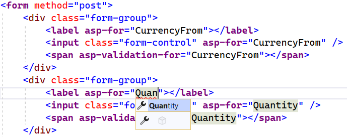
Figure 18.2 In Visual Studio, Tag Helpers are distinguishable from normal elements by being bold and a different color from standard HTML elements and attributes.
图 18.2 在 Visual Studio 中,标记帮助程序与普通元素的区别在于粗体和与标准 HTML 元素和属性不同的颜色。
Tag Helpers are extra attributes on standard HTML elements (or new elements entirely) that work by modifying the HTML element they’re attached to. They let you easily integrate your server-side values, such as those exposed on your PageModel, with the generated HTML.
标签帮助程序是标准 HTML 元素(或完全是新元素)上的额外属性,通过修改它们所附加到的 HTML 元素来工作。它们可让您轻松地将服务器端值(例如 PageModel 上公开的值)与生成的 HTML 集成。
Notice that listing 18.1 doesn’t specify the captions to display in the labels. Instead, you declaratively use asp-for="CurrencyFrom" to say “For this <label>, use the CurrencyFrom property to work out what caption to use.” Similarly, for the <input> elements, Tag Helpers are used to
请注意,清单 18.1 没有指定要在标签中显示的标题。相反,您以声明方式使用 asp-for=“CurrencyFrom” 来表示 <label>,请使用 CurrencyFrom 属性来确定要使用的标题。同样,对于 <input>元素,Tag Helpers 用于
• Automatically populate the value from the PageModel property.
自动填充 PageModel 属性中的值。
• Choose the correct id and name, so that when the form is POSTed back to the Razor Page, the property is model-bound correctly.
选择正确的 ID 和名称,以便在将表单 POST 回 Razor 页面时,该属性将正确进行模型绑定。
• Choose the correct input type to display (for example, a number input for the Quantity property).
选择要显示的正确输入类型 (例如,Quantity 属性的数字输入)。
• Display any validation errors, as shown in figure 18.3.
显示所有验证错误,如图 18.3 所示。
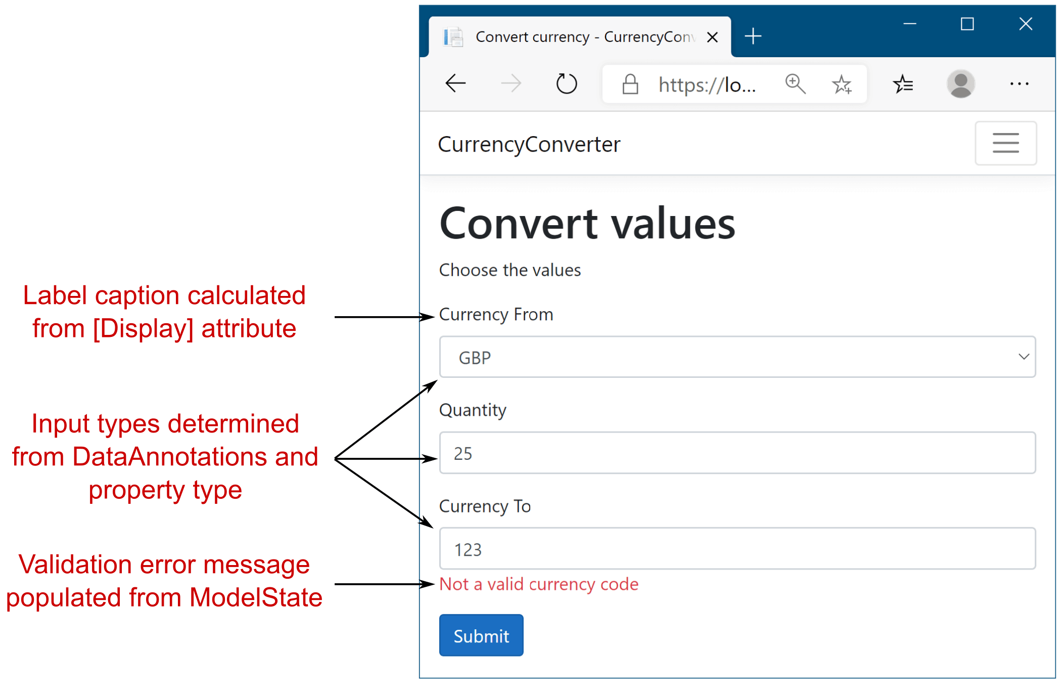
Figure 18.3 Tag Helpers hook into the metadata provided by DataAnnotations attributes, as well as the property types themselves. The Validation Tag Helper can even populate error messages based on the ModelState, as you saw in chapter 16.
图 18.3 标记帮助程序挂接到 DataAnnotations 属性提供的元数据以及属性类型本身。Validation Tag Helper 甚至可以根据 ModelState 填充错误消息,如第 16 章所示。
Tag Helpers can perform a variety of functions by modifying the HTML elements they’re applied to. This chapter introduces several common Tag Helpers and how to use them, but it’s not an exhaustive list. I don’t cover all the helpers that come out of the box in ASP.NET Core (there are more coming with every release!), and you can easily create your own, as you’ll see in chapter 32. Alternatively, you could use those published by others on NuGet or GitHub.
标签帮助程序可以通过修改它们所应用的 HTML 元素来执行各种功能。本章介绍了几种常见的 Tag Helper 及其使用方法,但并非详尽无遗。我没有涵盖 ASP.NET Core 中开箱即用的所有帮助程序(每个版本都会提供更多帮助程序),您可以轻松创建自己的帮助程序,如第 32 章所示。或者,您也可以使用其他人在 NuGet 或 GitHub 上发布的 Navi。
WebForms flashbacks
WebForms 闪回For those who used ASP.NET back in the day of WebForms, before the advent of the Model-View-Controller (MVC) pattern for web development, Tag Helpers may be triggering bad memories. Although the asp- prefix is somewhat reminiscent of ASP.NET Web Server control definitions, never fear; the two are completely different beasts.
对于那些在 WebForms 时代使用 ASP.NET 的人来说,在用于 Web 开发的模型-视图-控制器 (MVC) 模式出现之前,标记帮助程序可能会触发糟糕的回忆。尽管 asp- 前缀有点让人想起 ASP.NET Web 服务器控件定义,但不要害怕;两者是完全不同的野兽。Web Server controls were added directly to a page’s backing C# class and had a broad scope that could modify seemingly unrelated parts of the page. Coupled with that, they had a complex life cycle that was hard to understand and debug when things weren’t working. The perils of trying to work with that level of complexity haven’t been forgotten, and Tag Helpers aren’t the same.
Web 服务器控件直接添加到页面的支持 C# 类中,并且具有广泛的范围,可以修改页面中看似不相关的部分。再加上,它们的生命周期很复杂,当事情不正常时,很难理解和调试。尝试处理这种复杂程度的危险并没有被遗忘,标签帮助程序也不一样。Tag Helpers don’t have a life cycle; they participate in the rendering of the element to which they’re attached, and that’s it. They can modify the HTML element they’re attached to, but they can’t modify anything else on your page, making them conceptually much simpler. An additional capability they bring is the ability to have multiple Tag Helpers acting on a single element—something Web Server controls couldn’t easily achieve.
标记帮助程序没有生命周期;它们参与渲染它们所附加到的元素,仅此而已。他们可以修改它们所附加到的 HTML 元素,但不能修改页面上的任何其他内容,从而在概念上使它们变得更加简单。它们带来的另一项功能是能够让多个 Tag Helpers 作用于单个元素 — 这是 Web Server 控件无法轻松实现的。Overall, if you’re writing Razor templates, you’ll have a much more enjoyable experience if you embrace Tag Helpers as integral to its syntax. They bring a lot of benefits without obvious downsides, and your cross-platform-editor friends will thank you!
总的来说,如果你正在编写 Razor 模板,如果你将 Tag Helpers 作为其语法的组成部分,你将获得更愉快的体验。它们带来了很多好处,而且没有明显的缺点,你的跨平台编辑器朋友会感谢你!
18.2 Creating forms using Tag Helpers
18.2 使用标记帮助程序创建表单
In this section you’ll learn how to use some of the most useful Tag Helpers: Tag Helpers that work with forms. You’ll learn how to use them to generate HTML markup based on properties of your PageModel, creating the correct id and name attributes, and setting the value of the element to the model property’s value (among other things). This capability significantly reduces the amount of markup you need to write manually.
在本节中,您将学习如何使用一些最有用的 Tag Helpers:使用表单的 Tag Helpers。您将学习如何使用它们根据 PageModel 的属性生成 HTML 标记,创建正确的 id 和 name 属性,以及将元素的值设置为 model 属性的值(以及其他内容)。此功能显著减少了您需要手动编写的标记量。
Imagine you’re building the checkout page for the currency converter application, and you need to capture the user’s details on the checkout page. In chapter 16 you built a UserBindingModel model (shown in listing 18.2), added DataAnnotations attributes for validation, and saw how to model-bind it in a POST to a Razor Page. In this chapter you’ll see how to create the view for it by exposing the UserBindingModel as a property on your PageModel.
假设您正在为货币转换器应用程序构建结帐页面,并且您需要在结帐页面上捕获用户的详细信息。在第 16 章中,您构建了一个 UserBindingModel 模型(如清单 18.2 所示),添加了用于验证的 DataAnnotations 属性,并了解了如何在 POST 中将其模型绑定到 Razor 页面。在本章中,您将了解如何通过将 UserBindingModel 作为 PageModel 上的属性公开来为其创建视图。
Warning With Razor Pages, you often expose the same object in your view that you use for model binding. When you do this, you must be careful to not include sensitive values (that shouldn’t be edited) in the binding model, to prevent mass-assignment attacks on your app. You can read more about these attacks on my blog at http://mng.bz/RXw0.
警告:使用 Razor Pages,您通常会在视图中公开用于模型绑定的相同对象。执行此作时,必须注意不要在绑定模型中包含敏感值(不应编辑),以防止对应用程序进行批量赋值攻击。您可以在我的博客 http://mng.bz/RXw0 上阅读有关这些攻击的更多信息。
Listing 18.2 UserBindingModel for creating a user on a checkout page
列表 18.2 用于在结帐页面上创建用户的 UserBindingModel
public class UserBindingModel
{
    [Required]
    [StringLength(100, ErrorMessage = "Maximum length is {1}")]
    [Display(Name = "Your name")]
    public string FirstName { get; set; }

    [Required]
    [StringLength(100, ErrorMessage = "Maximum length is {1}")]
    [Display(Name = "Last name")]
    public string LastName { get; set; }

    [Required]
    [EmailAddress]
    public string Email { get; set; }

    [Phone(ErrorMessage = "Not a valid phone number.")]
    [Display(Name = "Phone number")]
    public string PhoneNumber { get; set; }
}
The UserBindingModel is decorated with various DataAnnotations attributes. In chapter 16 you saw that these attributes are used during model validation when the model is bound to a request, before the page handler is executed. These attributes are also used by the Razor templating language to provide the metadata required to generate the correct HTML when you use Tag Helpers.
UserBindingModel 使用各种 DataAnnotations 属性进行修饰。在第 16 章中,你看到这些属性在模型验证期间、当模型绑定到请求时、在执行页面处理程序之前使用。Razor 模板语言还使用这些属性来提供在使用标记帮助程序时生成正确 HTML 所需的元数据。
You can use the pattern I described in chapter 16, exposing a UserBindindModel as an Input property of your PageModel, to use the model for both model binding and in your Razor view:
您可以使用我在第 16 章 将 UserBindindModel 公开为 PageModel 的 Input 属性中描述的模式,将该模型用于模型绑定和 Razor 视图:
public class CheckoutModel: PageModel
{
    [BindProperty]
    public UserBindingModel Input { get; set; }
}
With the help of the UserBindingModel property, Tag Helpers, and a little HTML, you can create a Razor view that lets the user enter their details, as shown in figure 18.4.
借助 UserBindingModel 属性、标记帮助程序和一些 HTML,您可以创建一个允许用户输入其详细信息的 Razor 视图,如图 18.4 所示。
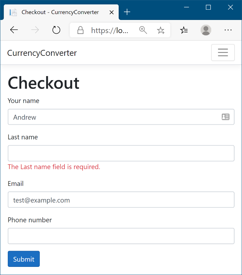
Figure 18.4 The checkout page for an application. The HTML is generated based on a UserBindingModel, using Tag Helpers to render the required element values, input types, and validation messages.
图 18.4 应用程序的结帐页面。HTML 是基于 UserBindingModel 生成的,使用标记帮助程序呈现所需的元素值、输入类型和验证消息。
The Razor template to generate this page is shown in listing 18.3. This code uses a variety of tag helpers, including
用于生成此页面的 Razor 模板如清单 18.3 所示。此代码使用各种标签帮助程序,包括
• A Form Tag Helper on the <form> element
<form> 元素上的表单标记帮助程序
• Label Tag Helpers on the <label>
标签标签帮助程序
• Input Tag Helpers on the <input>
输入标记帮助程序
• Validation Message Tag Helpers on <span> validation elements for each property in the UserBindingModel
UserBindingModel 中每个属性的验证元素上的验证消息 <span>标记帮助程序
Listing 18.3 Razor template for binding to UserBindingModel on the checkout page
列表 18.3 用于在结帐页面上绑定到 UserBindingModel 的 Razor 模板
@page
@model CheckoutModel    #A
@{
    ViewData["Title"] = "Checkout";
}
<h1>@ViewData["Title"]</h1>
<form asp-page="Checkout">      #B
    <div class="form-group">
        <label asp-for="Input.FirstName"></label>               #C
        <input class="form-control" asp-for="Input.FirstName" />
        <span asp-validation-for="Input.FirstName"></span>
    </div>
    <div class="form-group">
        <label asp-for="Input.LastName"></label>
        <input class="form-control" asp-for="Input.LastName" />
        <span asp-validation-for="Input.LastName"></span>
    </div>
    <div class="form-group">
        <label asp-for="Input.Email"></label>
        <input class="form-control" asp-for="Input.Email" />    #D
        <span asp-validation-for="Input.Email"></span>
    </div>
    <div class="form-group">
        <label asp-for="Input.PhoneNumber"></label>
        <input class="form-control" asp-for="Input.PhoneNumber" />
        <span asp-validation-for="Input.PhoneNumber"></span>    #E
    </div>
    <button type="submit" class="btn btn-primary">Submit</button>
</form>
❶ The CheckoutModel is the PageModel, which exposes a UserBindingModel on the Input property.
CheckoutModel 是 PageModel,它在 Input 属性上公开 UserBindingModel。
❷ Form Tag Helpers use routing to determine the URL the form will be posted to.
表单标签帮助程序使用路由来确定表单将发布到的 URL。
❸ The Label Tag Helper uses DataAnnotations on a property to determine the caption to display.
Label Tag Helper 在属性上使用 DataAnnotations 来确定要显示的标题。
❹ The Input Tag Helper uses DataAnnotations to determine the type of input to generate.
Input Tag Helper 使用 DataAnnotations 来确定要生成的输入类型。
❺ The Validation Tag Helper displays error messages associated with the given property.
Validation Tag Helper 显示与给定属性关联的错误消息。
You can see the HTML markup that this template produces in listing 18.4, which renders in the browser as you saw in figure 18.4. You can see that each of the HTML elements with a Tag Helper has been customized in the output: the <form> element has an action attribute, the <input> elements have an id and name based on the name of the referenced property, and both the <input> and <span> have data- attributes for validation.
您可以在清单 18.4 中看到此模板生成的 HTML 标记,该标记在浏览器中呈现,如图 18.4 所示。您可以看到,每个带有 Tag Helper 的 HTML 元素在输出中都已自定义: <form>元素具有 action 属性,<input> 元素具有基于引用属性名称的 id 和 name,并且<input> 和<span> 都具有用于验证的 data- 属性。
Listing 18.4 HTML generated by the Razor template on the checkout page
列表 18.4 结帐页面上 Razor 模板生成的 HTML
<form action="/Checkout" method="post">
  <div class="form-group">
    <label for="Input_FirstName">Your name</label>
    <input class="form-control" type="text"
      data-val="true" data-val-length="Maximum length is 100"
      id="Input_FirstName" data-val-length-max="100"
      data-val-required="The Your name field is required."
      Maxlength="100" name="Input.FirstName" value="" />
    <span data-valmsg-for="Input.FirstName"
      class="field-validation-valid" data-valmsg-replace="true"></span>
  </div>
  <div class="form-group">
    <label for="Input_LastName">Your name</label>
    <input class="form-control" type="text"
      data-val="true" data-val-length="Maximum length is 100"
      id="Input_LastName" data-val-length-max="100"
      data-val-required="The Your name field is required."
      Maxlength="100" name="Input.LastName" value="" />
    <span data-valmsg-for="Input.LastName"
      class="field-validation-valid" data-valmsg-replace="true"></span>
  </div>
  <div class="form-group">
    <label for="Input_Email">Email</label>
    <input class="form-control" type="email" data-val="true"
      data-val-email="The Email field is not a valid e-mail address."
      Data-val-required="The Email field is required."
      Id="Input_Email" name="Input.Email" value="" />
    <span class="text-danger field-validation-valid"
      data-valmsg-for="Input.Email" data-valmsg-replace="true"></span>
    </div>
  <div class="form-group">
    <label for="Input_PhoneNumber">Phone number</label>
    <input class="form-control" type="tel" data-val="true"
      data-val-phone="Not a valid phone number." Id="Input_PhoneNumber"
      name="Input.PhoneNumber" value="" />
    <span data-valmsg-for="Input.PhoneNumber"
      class="text-danger field-validation-valid"
      data-valmsg-replace="true"></span>
  </div>
  <button type="submit" class="btn btn-primary">Submit</button>
  <input name="__RequestVerificationToken" type="hidden"
    value="CfDJ8PkYhAINFx1JmYUVIDWbpPyy_TRUNCATED" />
</form>
Wow, that’s a lot of markup! If you’re new to working with HTML, this might all seem a little overwhelming, but the important thing to notice is that you didn’t have to write most of it! The Tag Helpers took care of most of the plumbing for you. That’s basically Tag Helpers in a nutshell; they simplify the fiddly mechanics of building HTML forms, leaving you to concentrate on the overall design of your application instead of writing boilerplate markup.
哇,好多标记啊!如果您刚开始使用 HTML,这可能看起来有点让人不知所措,但需要注意的重要一点是,您不必编写大部分内容!Tag Helpers 为您处理了大部分管道工作。简而言之,这基本上就是 Tag Helpers;它们简化了构建 HTML 表单的繁琐机制,让您专注于应用程序的整体设计,而不是编写样板标记。
NOTE If you’re using Razor to build your views, Tag Helpers will make your life easier, but they’re entirely optional. You’re free to write raw HTML without them or to use the legacy HTML Helpers.
注意:如果您使用 Razor 构建视图,标记帮助程序将使您的生活更轻松,但它们完全是可选的。您可以自由编写没有它们的原始 HTML,也可以使用旧版 HTML 帮助程序。
Tag Helpers simplify and abstract the process of HTML generation, but they generally try to do so without getting in your way. If you need the final generated HTML to have a particular attribute, you can add it to your markup. You can see that in the previous listings where class attributes are defined on <input> elements, such as <input class="form-control" asp-for="Input.FirstName" />. They pass untouched from Razor to the HTML output.
标记帮助程序简化和抽象了 HTML 生成过程,但它们通常会尝试在不妨碍您的情况下这样做。如果需要最终生成的 HTML 具有特定属性,可以将其添加到标记中。你可以看到,在前面的清单中,类属性是在 <input> 元素上定义的,比如 <input class="form-control" asp-for="Input.FirstName" />.它们将原封不动的 Razor 传递到 HTML 输出。
Tip This is different from the way HTML Helpers worked in legacy ASP.NET; HTML helpers often require jumping through hoops to set attributes in the generated markup.
提示:这与 HTML 帮助程序在旧版 ASP.NET 中的工作方式不同;HTML 帮助程序通常需要跳过重重障碍才能在生成的标记中设置属性。
Even better, you can also override attributes that are normally generated by a Tag Helper, like the type attribute on an <input> element. For example, if the FavoriteColor property on your PageModel was a string, by default Tag Helpers would generate an <input> element with type="text". Updating your markup to use the HTML5 color picker type is trivial; set the type explicitly in your Razor view:
更好的是,您还可以覆盖通常由 Tag Helper 生成的属性,例如<input> 元素上的 type 属性。例如,如果 PageModel 上的 FavoriteColor 属性是一个字符串,则默认情况下,标记帮助程序将生成一个具有 type=“text” 的<input> 元素。更新标记以使用 HTML5 颜色选取器类型非常简单;在 Razor 视图中显式设置类型:
<input type="color" asp-for="FavoriteColor" />Tip HTML5 adds a huge number of features, including lots of form elements that you may not have come across before, such as range inputs and color pickers. You can read about them on the Mozilla Developer Network website at http://mng.bz/qOc1.
提示:HTML5 添加了大量功能,包括许多您以前可能没有遇到过的表单元素,例如范围输入和颜色选择器。您可以在 Mozilla Developer Network 网站上阅读有关它们的信息,网址为 http://mng.bz/qOc1。
For the remainder of section 18.2, you’ll build the currency converter Razor templates from scratch, adding Tag Helpers as you find you need them. You’ll probably find you use most of the common form Tag Helpers in every application you build, even if it’s on a simple login page.
在第 18.2 节的其余部分,您将从头开始构建货币转换器 Razor 模板,并根据需要添加 Tag Helpers。您可能会发现,在构建的每个应用程序中都使用了大多数常见形式的 Tag Helpers,即使它位于简单的登录页面上。
18.2.1 The Form Tag Helper
18.2.1 Form 标记帮助程序
The first thing you need to start building your HTML form is, unsurprisingly, the <form> element. In listing 18.3 the <form> element was augmented with an asp-page Tag Helper attribute:
毫无疑问,开始构建 HTML 表单需要做的第一件事是<form>元素。在清单 18.3 中,该<form>元素被扩充了一个 asp-page Tag Helper 属性:
<form asp-page="Checkout">The Tag Helper adds action and method attributes to the final HTML, indicating which URL the form should be sent to when it’s submitted and the HTTP verb to use:
标记帮助程序将 action 和 method 属性添加到最终的 HTML 中,指示表单在提交时应发送到哪个 URL,以及要使用的 HTTP 动词:
<form action="/Checkout" method="post">Setting the asp-page attribute allows you to specify a different Razor Page in your application that the form will be posted to when it’s submitted. If you omit the asp-page attribute, the form will post back to the same URL it was served from. This is common with Razor Pages. You normally handle the result of a form post in the same Razor Page that is used to display it.
设置 asp-page 属性后,可以在应用程序中指定不同的 Razor 页面,表单在提交时将发布到该页面。如果省略 asp-page 属性,表单将回发到提供它的同一 URL。这在 Razor Pages 中很常见。通常在用于显示表单帖子的同一 Razor Page 中处理表单帖子的结果。
Warning If you omit the asp-page attribute, you must add the method="post" attribute manually. It’s important to add this attribute so the form is sent using the POST verb instead of the default GET verb. Using GET for forms can be a security risk.
警告:如果省略 asp-page 属性,则必须手动添加 method=“post” 属性。添加此属性非常重要,以便使用 POST 动词而不是默认的 GET 动词发送表单。对表单使用 GET 可能会带来安全风险。
The asp-page attribute is added by a FormTagHelper. This Tag Helper uses the value provided to generate a URL for the action attribute, using the URL generation features of routing that I described in chapters 5 and 14.
asp-page 属性由 FormTagHelper 添加。此 Tag Helper 使用提供的值为 action 属性生成 URL,使用我在第 5 章和第 14 章中描述的路由的 URL 生成功能。
NOTE Tag Helpers can make multiple attributes available on an element. Think of them like properties on a Tag Helper configuration object. Adding a single asp- attribute activates the Tag Helper on the element. Adding more attributes lets you override further default values of its implementation.
注意:标记帮助程序可以在一个元素上提供多个属性。将它们视为 Tag Helper 配置对象上的属性。添加单个 asp- 属性会激活元素上的 Tag Helper。添加更多属性可让您覆盖其实现的更多默认值。
The Form Tag Helper makes several other attributes available on the <form> element that you can use to customize the generated URL. I hope you’ll remember that you can set route values when generating URLs. For example, if you have a Razor Page called Product.cshtml that uses the directive
Form Tag Helper 在 <form> 元素上提供了几个其他属性,您可以使用这些属性来自定义生成的 URL。我希望您会记住,您可以在生成 URL 时设置路由值。例如,如果你有一个名为 Product.cshtml 的 Razor 页面,该页面使用指令
@page "{id}"the full route template for the page would be "Product/{id}". To generate the URL for this page correctly, you must provide the {id} route value. How can you set that value using the Form Tag Helper?
页面的完整路由模板将为 “Product/{id}”。要正确生成此页面的 URL,您必须提供 {id} 路由值。如何使用 Form Tag Helper 设置该值?
The Form Tag Helper defines an asp-route- wildcard attribute that you can use to set arbitrary route parameters. Set the in the attribute to the route parameter name. For example, to set the id route parameter, you’d set the asp-route-id value. If the ProductId property of your PageModel contains the id value required, you could use:
表单标记帮助程序定义可用于设置任意路由参数的 asp-route- 通配符属性。将 in 属性设置为路由参数名称。例如,要设置 id 路由参数,您需要设置 asp-route-id 值。如果 PageModel 的 ProductId 属性包含所需的 id 值,则可以使用:
<form asp-page="Product" asp-route-id="@Model.ProductId">Based on the route template of the Product.cshtml Razor Page (and assuming ProductId=5 in this example), this would generate the following markup:
根据 Product.cshtml Razor 页面的路由模板(在此示例中假设 ProductId=5),这将生成以下标记:
<form action="/Product/5" method="post">You can add as many asp-route-* attributes as necessary to your <form> to generate the correct action URL. You can also set the Razor Page handler to use the asp-page-handler attribute. This ensures that the form POST will be handled by the handler you specify.
您可以根据需要将任意数量的 asp-route-* 属性添加到 <form> 以生成正确的作 URL。您还可以将 Razor Page 处理程序设置为使用 asp-page-handler 属性。这可确保表单 POST 将由您指定的处理程序处理。
NOTE The Form Tag Helper has many additional attributes, such as asp-action and asp-controller, that you generally won’t use with Razor Pages. Those are useful only if you’re using MVC controllers with views. In particular, look out for the asp-route attribute—this is not the same as the asp-route- attribute. The former is used to specify a named route (such as a named minimal API endpoint), and the latter is used to specify the route values to use during URL generation.
注意:表单标记帮助程序具有许多其他属性,例如 asp-action 和 asp-controller,这些属性通常不会与 Razor Pages 一起使用。仅当您将 MVC 控制器与视图一起使用时,这些才有用。特别是,请注意 asp-route 属性 — 这与 asp-route- 属性不同。前者用于指定命名路由(例如命名的最小 API 终端节点),后者用于指定在 URL 生成期间要使用的路由值。
The main job of the Form Tag Helper is to generate the action attribute, but it performs one additional important function: generating a hidden <input> field needed to prevent cross-site request forgery (CSRF) attacks.
Form Tag Helper 的主要工作是生成 action 属性,但它执行一项额外的重要功能:生成防止跨站点请求伪造 (CSRF) 攻击所需的隐藏<input> 字段。
DEFINITION Cross-site request forgery (CSRF) attacks are a website exploit that can allow actions to be executed on your website by an unrelated malicious website. You’ll learn about them in detail in chapter 29.
定义:跨站点请求伪造 (CSRF) 攻击是一种网站漏洞,可以允许不相关的恶意网站在您的网站上执行作。您将在第 29 章中详细了解它们。
You can see the generated hidden <input> at the bottom of the <form> in listing 18.4; it’s named RequestVerificationToken and contains a seemingly random string of characters. This field won’t protect you on its own, but I’ll describe in chapter 29 how it’s used to protect your website. The Form Tag Helper generates it by default, so you generally won’t need to worry about it, but if you need to disable it, you can do so by adding asp-antiforgery="false" to your <form> element.
你可以在清单 18.4 的 <form> 底部看到生成隐藏<input> ;它被命名为 RequestVerificationToken 并包含一个看似随机的字符串。此字段本身不会保护您,但我将在第 29 章中介绍如何使用它来保护您的网站。默认情况下,Form Tag Helper 会生成它,因此您通常无需担心它,但如果您需要禁用它,可以通过将 asp-antiforgery=“false” 添加到您的<form> 元素来实现。
The Form Tag Helper is obviously useful for generating the action URL, but it’s time to move on to more interesting elements—those that you can see in your browser!
表单标记帮助程序显然可用于生成作 URL,但现在是时候转向更有趣的元素了 — 您可以在浏览器中看到的元素!
18.2.2 The Label Tag Helper
18.2.2 标签标签帮助程序
Every <input> field in your currency converter application needs to have an associated label so the user knows what the <input> is for. You could easily create those yourself, manually typing the name of the field and setting the for attribute as appropriate, but luckily there’s a Tag Helper to do that for you.
货币转换器应用程序中的每个 <input> 字段都需要有一个关联的标签,以便用户知道 for what for what.您可以轻松地自己创建这些标记,手动键入字段的名称并根据需要设置 <input> for 属性,但幸运的是,有一个 Tag Helper 可以为您执行此作。
The Label Tag Helper is used to generate the caption (the visible text) and the for attribute for a <label> element, based on the properties in the PageModel. It’s used by providing the name of the property in the asp-for attribute:
Label Tag Helper 用于根据 PageModel 中的属性为<label> 元素生成标题(可见文本)和 for 属性。通过在 asp-for 属性中提供属性的名称来使用它:
<label asp-for="FirstName"></label>The Label Tag Helper uses the [Display] DataAnnotations attribute that you saw in chapter 16 to determine the appropriate value to display. If the property you’re generating a label for doesn’t have a [Display] attribute, the Label Tag Helper uses the name of the property instead. Consider this model in which the FirstName property has a [Display] attribute, but the Email property doesn’t:
Label Tag Helper 使用您在第 16 章中看到的 [Display] DataAnnotations 属性来确定要显示的适当值。如果要为其生成标签的属性没有 [Display] 属性,则 Label Tag Helper 会改用该属性的名称。请考虑以下模型:FirstName 属性具有 [Display] 属性,但 Email 属性没有:
public class UserModel
{
    [Display(Name = "Your name")]
    public string FirstName { get; set; }
    public string Email { get; set; }
}
The following Razor
以下 Razor
<label asp-for="FirstName"></label>
<label asp-for="Email"></label>
would generate this HTML:
将生成此 HTML:
<label for="FirstName">Your name</label>
<label for="Email">Email</label>
The inner text inside the <label> element uses the value set in the [Display] attribute, or the property name in the case of the Email property. Also note that the for attribute has been generated with the name of the property. This is a key bonus of using Tag Helpers; it hooks in with the element IDs generated by other Tag Helpers, as you’ll see shortly.
<label> 元素内部文本使用 [Display] 属性中设置的值,或者使用 Email 属性的属性名称。另请注意,已使用属性名称生成 for 属性。这是使用 Tag Helper 的一个关键好处;它与其他 Tag Helper 生成的元素 ID 挂钩,您很快就会看到。
NOTE The for attribute is important for accessibility. It specifies the ID of the element to which the label refers. This is important for users who are using a screen reader, for example, as they can tell what property a form field relates to.
注意:for 属性对于辅助功能非常重要。它指定标签所引用的元素的 ID。例如,这对于使用屏幕阅读器的用户来说非常重要,因为他们可以判断表单字段与哪个属性相关。
As well as properties on the PageModel, you can also reference sub-properties on child objects. For example, as I described in chapter 16, it’s common to create a nested class in a Razor Page, expose that as a property, and decorate it with the [BindProperty] attribute:
除了 PageModel 上的属性外,您还可以引用子对象上的子属性。例如,正如我在第 16 章中所描述的,在 Razor Page 中创建一个嵌套类,将其作为属性公开,并使用 [BindProperty] 属性对其进行修饰是很常见的:
public class CheckoutModel: PageModel
{
    [BindProperty]
    public UserBindingModel Input { get; set; }
}
You can reference the FirstName property of the UserBindingModel by “dotting” into the property as you would in any other C# code. Listing 18.3 shows more examples of this.
您可以通过在属性中“点”来引用 UserBindingModel 的 FirstName 属性,就像在任何其他 C# 代码中一样。清单 18.3 显示了更多这样的例子。
<label asp-for="Input.FirstName"></label>
<label asp-for="Input.Email"></label>
As is typical with Tag Helpers, the Label Tag Helper won’t override values that you set yourself. If, for example, you don’t want to use the caption generated by the helper, you could insert your own manually. The code
与标签帮助程序的典型情况一样,标签标签帮助程序不会覆盖您自己设置的值。例如,如果您不想使用帮助程序生成的标题,则可以手动插入自己的标题。代码:
<label asp-for="Email">Please enter your Email</label>would generate this HTML:
将生成此 HTML:
<label for="Email">Please enter your Email</label>As ever, you’ll generally have an easier time with maintenance if you stick to the standard conventions and don’t override values like this, but the option is there. Next up is a biggie: the Input and Textarea Tag Helpers.
与往常一样,如果您坚持标准约定并且不覆盖这样的值,您通常会更轻松地进行维护,但选项就在那里。接下来是一个大问题:Input 和 Textarea 标记帮助程序。
18.2.3 The Input and Textarea Tag Helpers
18.2.3 input 和 textarea 标记帮助程序
Now you’re getting into the meat of your form: the <input> elements that handle user input. Given that there’s such a wide array of possible input types, there’s a variety of ways they can be displayed in the browser. For example, Boolean values are typically represented by a checkbox type <input> element, whereas integer values would use a number type <input> element, and a date would use the date type, as shown in figure 18.5.
现在,你进入了表单的核心:处理用户输入的 <input>元素。鉴于可能的输入类型如此广泛,它们在浏览器中的显示方式多种多样。例如,布尔值通常由复选框类型 <input>元素表示,而整数值将使用数字类型 <input>元素,日期将使用日期类型,如图 18.5 所示。
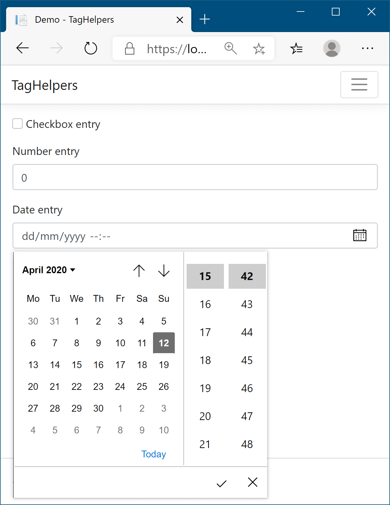
Figure 18.5 Various input element types. The exact way in which each type is displayed varies by browser.
图 18.5 各种输入元素类型。每种类型的确切显示方式因浏览器而异。
To handle this diversity, the Input Tag Helper is one of the most powerful Tag Helpers. It uses information based on both the type of the property (bool, string, int, and so on) and any DataAnnotations attributes applied to it ([EmailAddress] and [Phone], among others) to determine the type of the input element to generate. The DataAnnotations are also used to add data-val- client-side validation attributes to the generated HTML.
为了处理这种多样性,Input Tag Helper 是最强大的 Tag Helper 之一。它使用基于属性类型(bool、string、int 等)和应用于它的任何 DataAnnotations 属性([EmailAddress] 和 [Phone] 等)的信息来确定要生成的输入元素的类型。DataAnnotations 还用于将 data-val- 客户端验证属性添加到生成的 HTML 中。
Consider the Email property from listing 18.2 that was decorated with the [EmailAddress] attribute. Adding an <input> is as simple as using the asp-for attribute:
请考虑清单 18.2 中的 Email 属性,该属性使用 [EmailAddress] 属性进行修饰。添加 <input>就像使用 asp-for 属性一样简单:
<input asp-for="Input.Email" />The property is a string, so ordinarily the Input Tag Helper would generate an <input> with type="text". But the addition of the [EmailAddress] attribute provides additional metadata about the property. Consequently, the Tag Helper generates an HTML5 <input> with type="email":
该属性是一个字符串,因此通常 Input Tag Helper 会生成一个带有 type=“text” 的 <input> 。但是,添加 [EmailAddress] 属性会提供有关属性的其他元数据。因此,标记帮助程序会生成一个 type=“email” 的 HTML5 <input> :
<input type="email" id="Input_Email" name="Input.Email"
    value="test@example.com" data-val="true"
    data-val-email="The Email Address field is not a valid e-mail address."
    Data-val-required="The Email Address field is required."
    />
You can take a whole host of things away from this example. First, the id and name attributes of the HTML element have been generated from the name of the property. The value of the id attribute matches the value generated by the Label Tag Helper in its for attribute, Input_Email. The value of the name attribute preserves the “dot” notation, Input.Email, so that model binding works correctly when the field is POSTed to the Razor Page.
您可以从这个例子中学到很多东西。首先,HTML 元素的 id 和 name 属性是从属性的名称生成的。id 属性的值与 Label Tag Helper 在其 for 属性 Input_Email 中生成的值匹配。Input.Email,name 属性的值保留“点”表示法,以便在将字段发布到 Razor 页面时,模型绑定正常工作。
Also, the initial value of the field has been set to the value currently stored in the property ("test@example.com", in this case). The type of the element has also been set to the HTML5 email type, instead of using the default text type.
此外,字段的初始值已设置为当前存储在属性中的值(在本例中为“test@example.com”)。元素的类型也已设置为 HTML5 电子邮件类型,而不是使用默认文本类型。
Perhaps the most striking addition is the swath of data-val- attributes. These can be used by client-side JavaScript libraries such as jQuery to provide client-side validation of your DataAnnotations constraints. Client-side validation provides instant feedback to users when the values they enter are invalid, providing a smoother user experience than can be achieved with server-side validation alone, as I described in chapter 16.
也许最引人注目的新增功能是大量的 data-val- 属性。客户端 JavaScript 库(如 jQuery)可以使用这些约束来提供 DataAnnotations 约束的客户端验证。客户端验证会在用户输入的值无效时向用户提供即时反馈,从而提供比单独使用服务器端验证更流畅的用户体验,如我在第 16 章中所述。
Client-side validation
客户端验证To enable client-side validation in your application, you need to add some jQuery libraries to your HTML pages. In particular, you need to include the jQuery, jQuery-validation, and jQuery-validation-unobtrusive JavaScript libraries. You can do this in several ways, but the simplest is to include the script files at the bottom of your view using
要在应用程序中启用客户端验证,您需要向 HTML 页面添加一些 jQuery 库。特别是,您需要包括 jQuery、jQuery-validation 和 jQuery-validation-unobtrusive JavaScript 库。您可以通过多种方式执行此作,但最简单的方法是使用
<script src="~/lib/jquery-validation/dist/jquery.validate.min.js"></script>
<script src="~/lib/jquery-validation-unobtrusive/jquery.validate.unobtrusive.min.js"></script>
The default templates include these scripts for you in a handy partial template that you can add to your page in a Scripts section. If you’re using the default layout and need to add client-side validation to your view, add the following section somewhere on your view:
默认模板将这些脚本包含在一个方便的部分模板中,您可以将其添加到页面的 Scripts 部分。如果您使用的是默认布局,并且需要向视图添加客户端验证,请在视图上的某个位置添加以下部分:
@section Scripts{
    @Html.Partial("_ValidationScriptsPartial")
}
This partial view references files in your wwwroot folder. The default layout template includes jQuery itself. If you don’t need to use jQuery in your application, you may want to consider a small alternative validation library called aspnet-client-validation. I describe why you might consider this library and how to use it in this blog post: http://mng.bz/V1pX.
此分部视图引用 wwwroot 文件夹中的文件。默认布局模板包括 jQuery 本身。如果您不需要在应用程序中使用 jQuery,则可能需要考虑一个名为 aspnet-client-validation 的小型替代验证库。我在这篇博文中描述了为什么会考虑使用这个库以及如何使用它:http://mng.bz/V1pX。You can also load these files, whether you’re using jQuery or aspnet-client-validation, from a content delivery network (CDN). If you want to take this approach, you should consider scenarios where the CDN is unavailable or compromised, as I discuss in this blog post: http://mng.bz/2e6d.
您还可以从内容分发网络 (CDN) 加载这些文件,无论您使用的是 jQuery 还是 aspnet-client-validation。如果您想采用这种方法,您应该考虑 CDN 不可用或受损的情况,正如我在这篇博文中讨论的那样:http://mng.bz/2e6d。
The Input Tag Helper tries to pick the most appropriate template for a given property based on DataAnnotations attributes or the type of the property. Whether this generates the exact <input> type you need may depend, to an extent, on your application. As always, you can override the generated type by adding your own type attribute to the element in your Razor template. Table 18.1 shows how some of the common data types are mapped to <input> types and how the data types themselves can be specified.
输入标记帮助程序尝试根据 DataAnnotations 属性或属性类型为给定属性选择最合适的模板。这是否生成您需要的确切类型可能在一定程度上取决于您的应用程序。与往常一样,您可以通过将自己的 type 属性添加到 Razor 模板中的 <input> 元素来替代生成的类型。Table 18.1 显示了如何将一些常见数据类型映射到类型以及如何指定数据类型本身。
Table 18.1 Common data types, how to specify them, and the input element type they map to
表 18.1 常见数据类型、如何指定它们以及它们映射到的输入元素类型
| Data type | How it’s specified | Input element type |
|---|---|---|
| byte, int, short, long, uint | Property type | number |
| decimal, double, float | Property type | text |
| bool | Property type | checkbox |
| string | Property type, [DataType(DataType.Text)] attribute | text |
| HiddenInput | [HiddenInput] attribute | hidden |
| Password | [Password] attribute | password |
| Phone | [Phone] attribute | tel |
| EmailAddress | [EmailAddress] attribute | |
| Url | [Url] attribute | url |
| Date | DateTime property type, [DataType(DataType.Date)] attribute | datetime-local |
The Input Tag Helper has one additional attribute that can be used to customize the way data is displayed: asp-format. HTML forms are entirely string-based, so when the value of an <input> is set, the Input Tag Helper must take the value stored in the property and convert it to a string. Under the covers, this performs a string.Format() on the property’s value, passing in the format string.
Input Tag Helper 具有一个可用于自定义数据显示方式的附加属性:asp-format。HTML 表单完全基于字符串,因此在设置 <input> 的值时,Input Tag Helper 必须获取存储在属性中的值并将其转换为字符串。在后台,这将执行一个字符串。Format() 对属性的值执行,并传入格式字符串。
The Input Tag Helper uses a default format string for each different data type, but with the asp-format attribute, you can set the specific format string to use. For example, you could ensure that a decimal property, Dec, is formatted to three decimal places with the following code:
Input Tag Helper 对每种不同的数据类型使用默认格式字符串,但使用 asp-format 属性,您可以设置要使用的特定格式字符串。例如,您可以使用以下代码确保将 decimal 属性 Dec 的格式设置为三位小数:
<input asp-for="Dec" asp-format="{0:0.000}" />If the Dec property had a value of 1.2, this would generate HTML similar to
如果 Dec 属性的值为 1.2,则生成类似于
<input type="text" id="Dec" name="Dec" value="1.200">Alternatively, you can define the format to use by adding the [DisplayFormat] attribute to the model property:
或者,您可以通过将 [DisplayFormat] 属性添加到 model 属性来定义要使用的格式:
[DisplayFormat("{0:0.000}")]
public decimal Dec { get; set; }
NOTE You may be surprised that decimal and double types are rendered as text fields and not as number fields. This is due to several technical reasons, predominantly related to the way different cultures render decimal points and number group separators. Rendering as text avoids errors that would appear only in certain browser-culture combinations.
注意您可能会惊讶地发现,decimal 和 double 类型呈现为文本字段,而不是数字字段。这是由于几个技术原因,主要与不同区域性呈现小数点和数字组分隔符的方式有关。呈现为文本可避免仅在某些浏览器区域性组合中出现的错误。
In addition to the Input Tag Helper, ASP.NET Core provides the Textarea Tag Helper. This works in a similar way, using the asp-for attribute, but it’s attached to a <textarea> element instead:
除了 Input Tag Helper 之外,ASP.NET Core 还提供 Textarea Tag Helper。这以类似的方式工作,使用 asp-for 属性,但它被附加到一个<textarea> 元素上:
<textarea asp-for="BigtextValue"></textarea>This generates HTML similar to the following. Note that the property value is rendered inside the element, and data-val- validation elements are attached as usual:
这将生成类似于以下内容的 HTML。请注意,property value 在元素内部呈现,并且 data-val- 验证元素像往常一样附加:
<textarea data-val="true" id="BigtextValue" name="BigtextValue"
    data-val-length="Maximum length 200." data-val-length-max="200"
    data-val-required="The Multiline field is required." >This is some text,
I'm going to display it
in a text area</textarea>
I hope that this section has hammered home how much typing Tag Helpers can cut down on, especially when using them in conjunction with DataAnnotations for generating validation attributes. But this is more than reducing the number of keystrokes required; Tag Helpers ensure that the markup generated is correct and has the correct name, id, and format to automatically bind your binding models when they’re sent to the server.
我希望本节已经阐明了 Tag Helpers 可以减少多少键入工作,尤其是在将它们与 DataAnnotations 结合使用以生成验证属性时。但这不仅仅是减少所需的击键次数;标记帮助程序确保生成的标记正确无误,并且具有正确的名称、ID 和格式,以便在将绑定模型发送到服务器时自动绑定绑定模型。
With <form>, <label>, and <input> under your belt, you’re able to build most of your currency converter forms. Before we look at displaying validation messages, there’s one more element to look at: the <select>, or drop-down, input.
使用 <form>, <label>和 <input> ,您可以构建大多数货币转换器表单。在我们查看显示验证消息之前,还有一个元素需要查看:<select>或下拉列表,输入。
18.2.4 The Select Tag Helper
As well as <input> fields, a common element you’ll see on web forms is the <select> element, or drop-down lists and list boxes. Your currency converter application, for example, could use a <select> element to let you pick which currency to convert from a list.
除了<input> 字段之外,您将在 Web 表单上看到的一个常见元素是 <select>元素,即下拉列表和列表框。例如,您的货币转换器应用程序可以使用一个 <select>元素让您从列表中选择要转换的货币。
By default, this element shows a list of items and lets you select one, but there are several variations, as shown in figure 18.6. As well as the normal drop-down list, you could show a list box, add multiselection, or display your list items in groups.
默认情况下,此元素显示一个项目列表并允许您选择一个,但有几种变体,如图 18.6 所示。除了常规下拉列表外,您还可以显示列表框、添加多选或成组显示列表项。
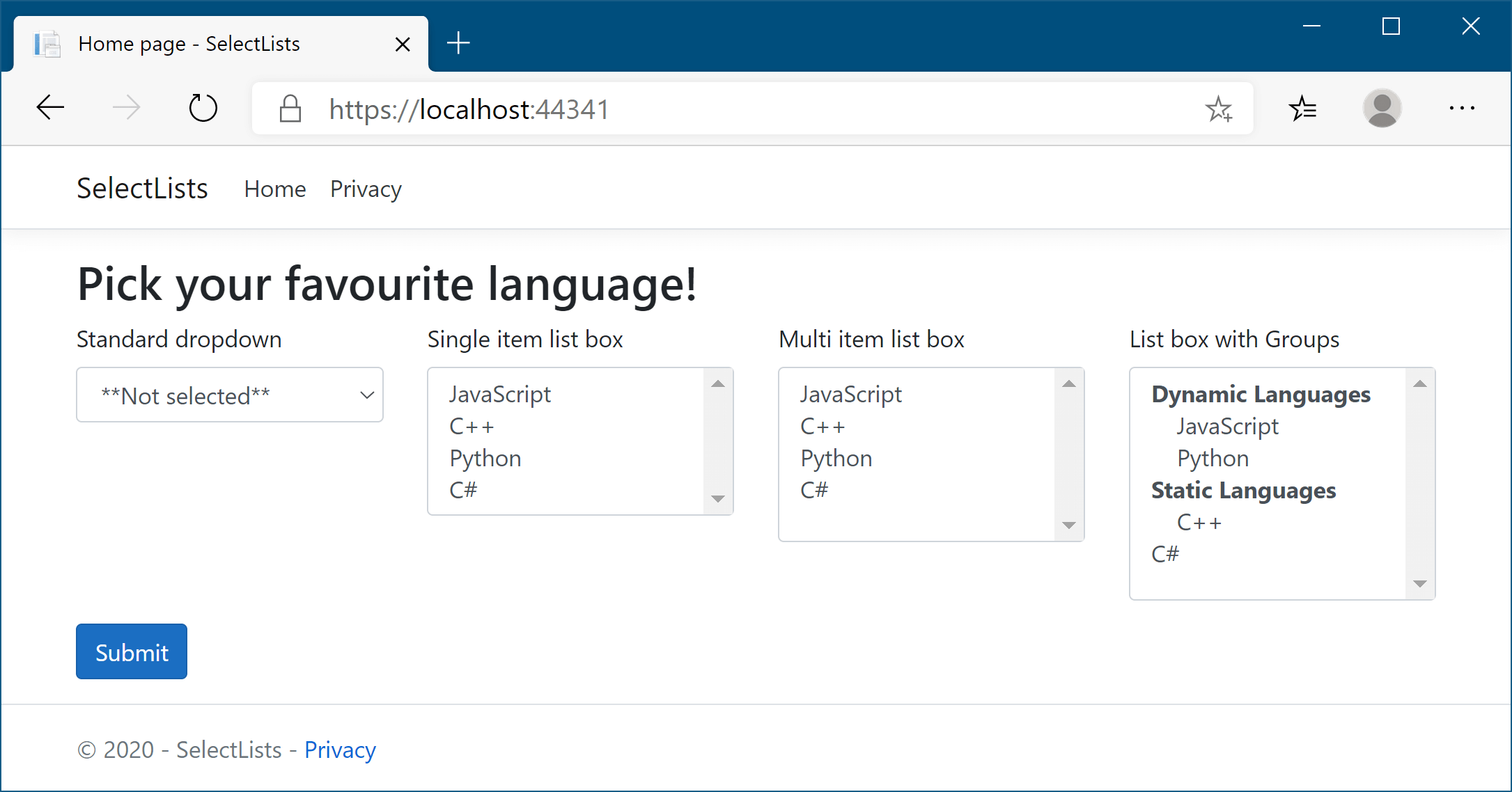
Figure 18.6 Some of the many ways to display <select> elements using the Select Tag Helper.
图 18.6 使用 Select Tag Helper 显示<select>元素的多种方法中的一些。
To use <select> elements in your Razor code, you’ll need to include two properties in your PageModel: one property for the list of options to display and one to hold the value (or values) selected. For example, listing 18.5 shows the properties on the PageModel used to create the three leftmost select lists shown in figure 18.6. Displaying groups requires a slightly different setup, as you’ll see shortly.
要在 Razor 代码中使用<select> 元素,您需要在 PageModel 中包含两个属性:一个属性用于显示选项列表,另一个属性用于保存所选值。例如,清单 18.5 显示了用于创建图 18.6 中所示的三个最左侧选择列表的 PageModel 上的属性。显示组需要的设置略有不同,您很快就会看到。
Listing 18.5 View model for displaying select element drop-down lists and list boxes
public class SelectListsModel: PageModel
{
    [BindProperty]                                #A
    public class InputModel Input { get; set; }   #A

    public IEnumerable<SelectListItem> Items { get; set; }    #B
        = new List<SelectListItem>                            #B
    {                                                         #B
        new SelectListItem{Value = "csharp", Text="C#"},       #B
        new SelectListItem{Value = "python", Text= "Python"},  #B
        new SelectListItem{Value = "cpp", Text="C++"},         #B
        new SelectListItem{Value = "java", Text="Java"},       #B
        new SelectListItem{Value = "js", Text="JavaScript"},   #B
        new SelectListItem{Value = "ruby", Text="Ruby"},       #B
    };                                                        #B

    public class InputModel
    {
        public string SelectedValue1 { get; set; }                #C
        public string SelectedValue2 { get; set; }                #C
        public IEnumerable<string> MultiValues { get; set; }    #D
    }
}
❶ The InputModel for binding the user’s selections to the select boxes
用于将用户的选择绑定到选择框的 InputModel
❷ The list of items to display in the select boxes
要在选择框中显示的项目列表
❸ These properties will hold the values selected by the single-selection select boxes.
这些属性将保存由单选选择框选择的值。
❹ To create a multiselect list box, use an IEnumerable<>.
若要创建多选列表框,请使用 IEnumerable<>。
This listing demonstrates several aspects of working with <select> lists:
此清单演示了使用<select>列表的几个方面:
• SelectedValue1/SelectedValue2—Used to hold the value selected by the user. They’re model-bound to the value selected from the drop-down list/list box and used to preselect the correct item when rendering the form.
SelectedValue1/SelectedValue2 - 用于保存用户选择的值。它们被模型绑定到从下拉列表/列表框中选择的值,并用于在呈现表单时预先选择正确的项目。
• MultiValues—Used to hold the selected values for a multiselect list. It’s an IEnumerable, so it can hold more than one selection per <select> element.
MultiValues - 用于保存多选列表的选定值。它是一个 IEnumerable,因此每个 <select> 元素可以保存多个选择。
• Items—Provides the list of options to display in the <select> elements. Note that the element type must be SelectListItem, which exposes the Value and Text properties, to work with the Select Tag Helper. This isn’t part of the InputModel, as we don’t want to model-bind these items to the request; they would normally be loaded directly from the application model or hardcoded. The order of the values in the Items property controls the order of items in the <select> list.
Items - 提供要在<select> 元素中显示的选项列表。请注意,元素类型必须是 SelectListItem,它公开 Value 和 Text 属性,才能使用 Select 标记帮助程序。这不是 InputModel 的一部分,因为我们不想将这些项模型绑定到请求;它们通常直接从应用程序模型加载或硬编码。Items 属性中值的顺序控制列表中项的顺序。
NOTE The Select Tag Helper works only with SelectListItem elements. That means you’ll normally have to convert from an application-specific list set of items (for example, a List<string> or List<MyClass>) to the UI-centric List<SelectListItem>.
注意:Select Tag Helper 仅适用于 SelectListItem 元素。这意味着您通常必须从特定于应用程序的列表项集(例如,a List<string>或 List<MyClass>)转换为以 UI 为中心的 List<SelectListItem>。
The Select Tag Helper exposes the asp-for and asp-items attributes that you can add to <select> elements. As for the Input Tag Helper, the asp-for attribute specifies the property in your PageModel to bind to. The asp-items attribute provides the IEnumerable<SelectListItem> to display the available <option> elements.
Select 标记帮助程序公开可添加到<select>元素的 asp-for 和 asp-items 属性。对于 Input Tag Helper,asp-for 属性指定要绑定到的 PageModel 中的属性。asp-items 属性提供 以IEnumerable<SelectListItem> 显示可用 <option> 元素。
Tip It’s common to want to display a list of enum options in a <select> list. This is so common that ASP.NET Core ships with a helper for generating a SelectListItem for any enum. If you have an enum of the TEnum type, you can generate the available options in your view using asp-items="Html.GetEnumSelectList<TEnum>()" .
提示:希望在列表中显示枚举选项 <select>列表是很常见的。这种情况非常常见,因此 ASP.NET Core 附带了一个帮助程序,用于为任何枚举生成 SelectListItem。如果您有 TEnum 类型的枚举,则可以使用 asp-items="Html.GetEnumSelectList<TEnum>()" 在视图中生成可用选项。
The following listing shows how to display a drop-down list, a single-selection list box, and a multiselection list box. It uses the PageModel from the previous listing, binding each <select> list value to a different property but reusing the same Items list for all of them.
下面的清单显示了如何显示下拉列表、单选列表框和多选列表框。它使用上一个清单中的 PageModel,将每个<select> 列表值绑定到不同的属性,但对所有列表重用相同的 Items 列表。
Listing 18.6 Razor template to display a select element in three ways
清单 18.6 以三种方式显示 select 元素的 Razor 模板
@page
@model SelectListsModel
<select asp-for="Input.SelectedValue1"   #A
    asp-items="Model.Items"></select>    #A
<select asp-for="Input.SelectedValue2"            #B
    asp-items="Model.Items" size="4"></select>    #B
<select asp-for="Input.MultiValues"      #C
    asp-items="Model.Items"></select>    #C
❶ Creates a standard drop-down select list by binding to a standard property in asp-for
通过绑定到 asp-for中的标准属性创建标准下拉列表
❷ Creates a single-select list box of height 4 by providing the standard HTML size attribute
通过提供标准 HTML 大小属性创建高度为 4 的单选列表框
❸ Creates a multiselect list box by binding to an IEnumerable property in asp-for
通过绑定到 asp-for 中的 IEnumerable 属性创建多选列表框
I hope you can see that the Razor for generating a drop-down <select> list is almost identical to the Razor for generating a multiselect <select> list. The Select Tag Helper takes care of adding the multiple HTML attribute to the generated output if the property it’s binding to is an IEnumerable.
我希望你能看到,用于生成下拉<select>列表的 Razor 与用于生成多选<select>列表的 Razor 几乎相同。Tag Helper 负责将 multiple HTML 属性添加到生成的输出中(如果它绑定到的属性是 IEnumerable)。
Warning The asp-for attribute must not include the Model. prefix. The asp-items attribute, on the other hand, must include it if referencing a property on the PageModel. The asp-items attribute can also reference other C# items, such as objects stored in ViewData, but using a PageModel property is the best approach.
警告:asp-for 属性不得包含 Model。前缀。另一方面,如果引用 PageModel 上的属性,则 asp-items 属性必须包含它。asp-items 属性还可以引用其他 C# 项,例如存储在 ViewData 中的对象,但使用 PageModel 属性是最好的方法。
You’ve seen how to bind three types of select lists so far, but the one I haven’t yet covered from figure 18.6 is how to display groups in your list boxes using <optgroup> elements. Luckily, nothing needs to change in your Razor code; you have to update only how you define your SelectListItems.
到目前为止,您已经了解了如何绑定三种类型的选择列表,但是图 18.6 中我还没有介绍的是如何使用 <optgroup> 元素在列表框中显示组。幸运的是,您的 Razor 代码中不需要更改任何内容;您只需更新定义 SelectListItems 的方式。
The SelectListItem object defines a Group property that specifies the SelectListGroup the item belongs to. The following listing shows how you could create two groups and assign each list item to a “dynamic” or “static” group, using a PageModel similar to that shown in listing 18.5. The final list item, C#, isn’t assigned to a group, so it will be displayed as normal, without an <optgroup>.
SelectListItem 对象定义一个 Group 属性,该属性指定项目所属的 SelectListGroup。下面的清单显示了如何使用类似于清单 18.5 中所示的 PageModel 创建两个组并将每个列表项分配给“动态”或“静态”组。最后一个列表项 C# 未分配给组,因此没有
Listing 18.7 Adding Groups to SelectListItems to create optgroup elements
清单 18.7 向 SelectListItems 添加组以创建 optgroup 元素
public class SelectListsModel: PageModel
{
    [BindProperty]
    public IEnumerable<string> SelectedValues { get; set; }    #A
    public IEnumerable<SelectListItem> Items { get; set; }

    public SelectListsModel()     #B
    {
        var dynamic = new SelectListGroup { Name = "Dynamic" };   #C
        var @static = new SelectListGroup { Name = "Static" };       #C
        Items = new List<SelectListItem>
        {
            new SelectListItem {
                Value= "js",
                Text="Javascript",
                Group = dynamic       #D
            },
            new SelectListItem {
                Value= "cpp",
                Text="C++",
                Group = @static        #D
            },
            new SelectListItem {
                Value= "python",
                Text="Python",
                Group = dynamic       #D
            },
            new SelectListItem {    #E
                Value= "csharp",    #E
                Text="C#",          #E
            }
        };
    }
}
With this in place, the Select Tag Helper generates <optgroup> elements as necessary when rendering the Razor to HTML. The Razor template
完成此作后,Select Tag Helper 会生成<optgroup>元素.
@page
@model SelectListsModel
<select asp-for="SelectedValues" asp-items="Model.Items"></select>
would be rendered to HTML as follows:
将呈现为 HTML,如下所示:
<select id="SelectedValues" name="SelectedValues" multiple="multiple">
    <optgroup label="Dynamic">
        <option value="js">JavaScript</option>
        <option value="python">Python</option>
    </optgroup>
    <optgroup label="Static">
        <option value="cpp">C++</option>
    </optgroup>
    <option value="csharp">C#</option>
</select>
Another common requirement when working with <select> elements is to include an option in the list that indicates that no value has been selected, as shown in figure 18.7. Without this extra option, the default <select> drop-down will always have a value, and it will default to the first item in the list.
使用<select>元素时的另一个常见要求是在列表中包含一个选项,该选项指示未选择任何值,如图 18.7 所示。如果没有这个额外的选项,<select>默认下拉列表将始终有一个值,并且它将默认为列表中的第一项。
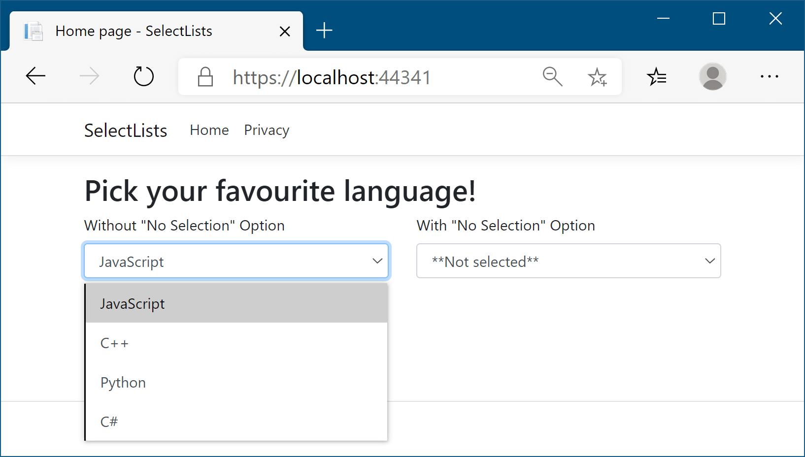
Figure 18.7 Without a “not selected” option, the <select> element will always have a value. This may not be the behavior you desire if you don’t want an <option> to be selected by default.
图 18.7 如果没有 “not selected” 选项, <select> 元素将始终具有一个值。如果您不希望默认选择<option> ,这可能不是您想要的行为。
You can achieve this in one of two ways: you could add the “not selected” option to the available SelectListItems, or you could add the option to the Razor manually, such as by using
您可以通过以下两种方式之一来实现此目的:您可以将“未选择”选项添加到可用的 SelectListItems,也可以手动将选项添加到 Razor,例如使用
<select asp-for="SelectedValue" asp-items="Model.Items">
    <option Value="">**Not selected**</option>
</select>
This will add an extra <option> at the top of your <select> element, with a blank Value attribute, allowing you to provide a “no selection” option for the user.
这将在<select> 元素顶部添加一个额外的<option> Value,其中包含一个空白的 Value 属性,允许您为用户提供 “no selection” 选项。
Tip Adding a “no selection” option to a <select> element is so common that you might want to create a partial view to encapsulate this logic.
提示:向元<select>素添加 “no selection” 选项非常常见,以至于您可能希望创建一个 partial view 来封装此逻辑。
With the Input Tag Helper and Select Tag Helper under your belt, you should be able to create most of the forms that you’ll need. You have all the pieces you need to create the currency converter application now, with one exception.
有了 Input Tag Helper 和 Select Tag Helper,您应该能够创建所需的大多数表单。您现在拥有创建货币转换器应用程序所需的所有部分,但有一个例外。
Remember that whenever you accept input from a user, you should always validate the data. The Validation Tag Helpers provide a way for you to display model validation errors to the user on your form without having to write a lot of boilerplate markup.
请记住,无论何时接受用户的输入,都应始终验证数据。验证标记帮助程序提供了一种在表单上向用户显示模型验证错误的方法,而无需编写大量样板标记。
18.2.5 The Validation Message and Validation Summary Tag Helpers
18.2.5 验证消息和验证摘要标记帮助程序
In section 18.2.3 you saw that the Input Tag Helper generates the necessary data-val- validation attributes on form input elements themselves. But you also need somewhere to display the validation messages. This can be achieved for each property in your view model using the Validation Message Tag Helper applied to a <span> by using the asp-validation-for attribute:
在第 18.2.3 节中,您看到 Input Tag Helper 在表单 input 元素本身上生成必要的 data-val- 验证属性。但您还需要在某个位置显示验证消息。这可以通过使用 asp-validation-for 属性应用于<span> 的验证消息标记帮助程序为视图模型中的每个属性实现:
<span asp-validation-for="Email"></span>When an error occurs during client-side validation, the appropriate error message for the referenced property is displayed in the <span>, as shown in figure 18.8. This <span> element is also used to show appropriate validation messages if server-side validation fails when the form is redisplayed.
当在客户端验证期间发生错误时,引用的属性的相应错误消息将显示在<span>中,如图 18.8 所示。此<span>元素还用于在重新显示表单时服务器端验证失败时显示相应的验证消息。
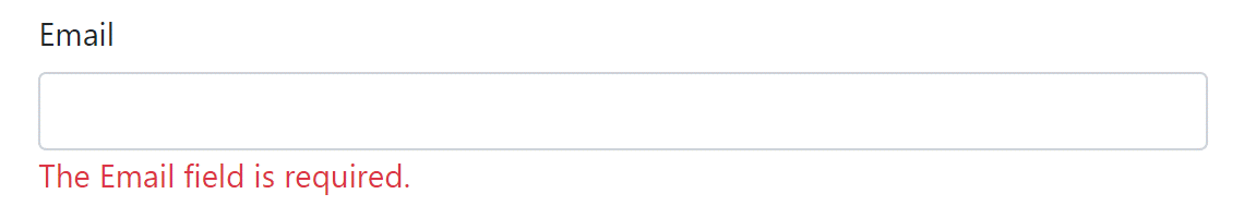
Figure 18.8 Validation messages can be shown in an associated <span> by using the Validation Message Tag Helper.
图 18.8 验证消息可以使用 Validation Message Tag Helper 显示在关联的<span>中。
Any errors associated with the Email property stored in ModelState are rendered in the element body, and the appropriate attributes to hook into jQuery validation are added:
与 ModelState 中存储的 Email 属性关联的任何错误都将呈现在元素正文中,并添加用于挂接到 jQuery 验证的相应属性:
<span class="field-validation-valid" data-valmsg-for="Email"
  data-valmsg-replace="true">The Email Address field is required.</span>
The validation error shown in the element is removed or replaced when the user updates the Email <input> field and client-side validation is performed.
当用户更新 Email <input>字段并执行客户端验证时,将删除或替换元素中显示的验证错误。
NOTE For more details on ModelState and server-side validation, see chapter 16.
注意有关 ModelState 和服务器端验证的更多详细信息,请参阅第 16 章。
As well as display validation messages for individual properties, you can display a summary of all the validation messages in a <div> with the Validation Summary Tag Helper, shown in figure 18.9. This renders a <ul> containing a list of the ModelState errors.
除了显示各个属性的验证消息外,您还可以使用 Validation Summary Tag Helper 在<div> 中显示所有验证消息的摘要,如图 18.9 所示。这将呈现一个包含 ModelState 错误列表的<ul> 。
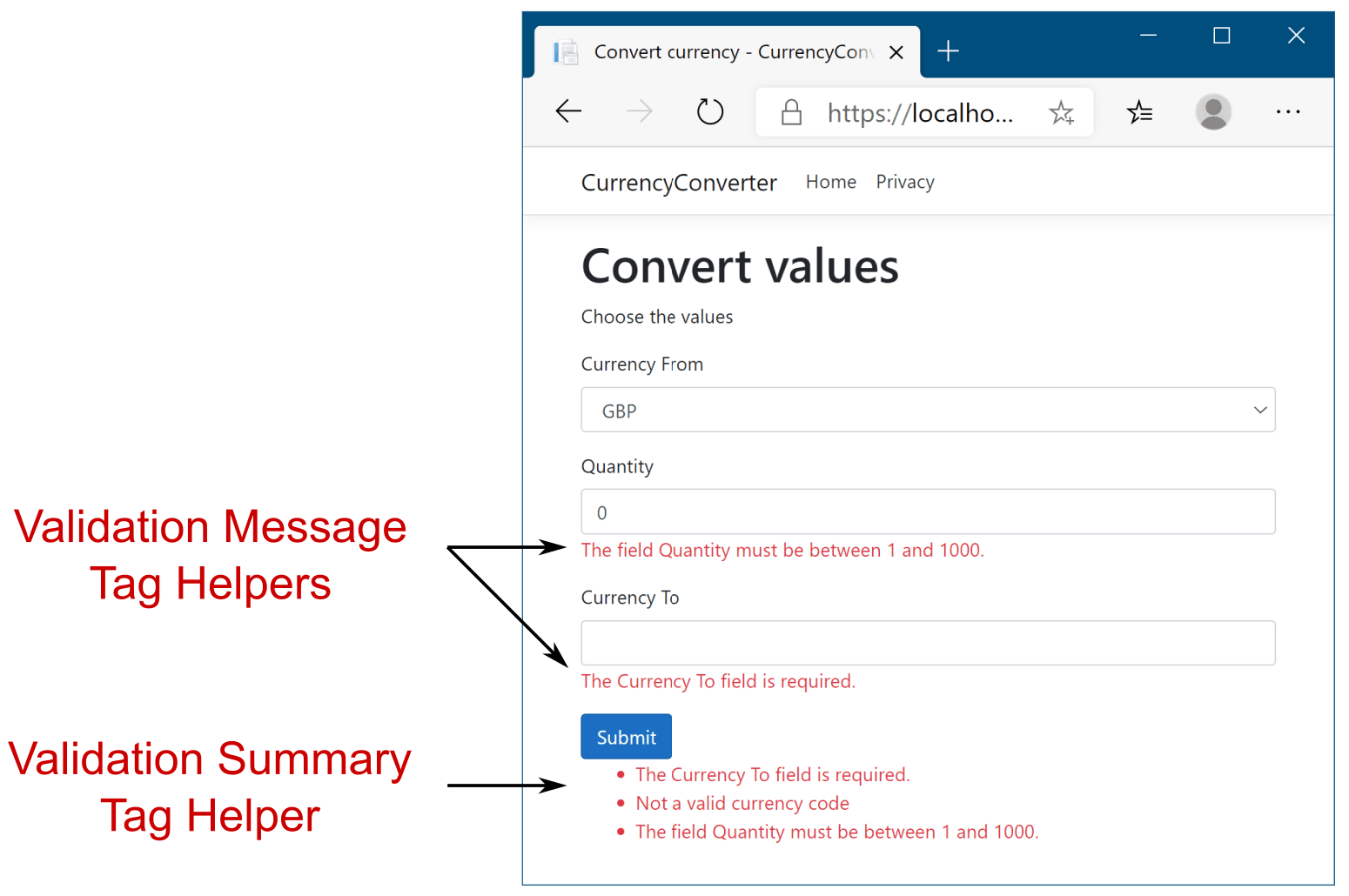
Figure 18.9 Form showing validation errors. The Validation Message Tag Helper is applied to <span>, close to the associated input. The Validation Summary Tag Helper is applied to a <div>, normally at the top or bottom of the form.
图 18.9 显示验证错误的表单。验证消息标记帮助程序应用于 <span>,靠近关联的输入。验证摘要标记帮助程序应用于<div>,通常位于表单的顶部或底部。
The Validation Summary Tag Helper is applied to a <div> using the asp-validation-summary attribute and providing a ValidationSummary enum value, such as
验证摘要标记帮助程序使用 asp-validation-summary 属性并提供 ValidationSummary 枚举值(如
<div asp-validation-summary="All"></div>The ValidationSummary enum controls which values are displayed, and it has three possible values:
ValidationSummary 枚举控制显示哪些值,它有三个可能的值:
• None—Don’t display a summary. (I don’t know why you’d use this.)
无 (None) - 不显示摘要。(我不知道你为什么会用这个。)
• ModelOnly—Display only errors that are not associated with a property.
“仅模型”(ModelOnly) - 仅显示与属性无关的错误。
• All—Display errors associated with either a property or the model.
“全部”(All) - 显示与属性或模型关联的错误。
The Validation Summary Tag Helper is particularly useful if you have errors associated with your page that aren’t specific to a single property. These can be added to the model state by using a blank key, as shown in listing 18.8. In this example, the property validation passed, but we provide additional model-level validation to check that we aren’t trying to convert a currency to itself.
如果存在与页面关联的错误,而这些错误并非特定于单个属性,则 Validation Summary Tag Helper 特别有用。这些可以通过使用空键添加到模型状态中,如清单 18.8 所示。在此示例中,属性验证通过,但我们提供了额外的模型级验证,以检查我们是否没有尝试将货币转换为自身。
Listing 18.8 Adding model-level validation errors to the ModelState
示例 18.8 向 ModelState 添加模型级验证错误
public class ConvertModel : PageModel
{
    [BindProperty]
    public InputModel Input { get; set; }

    [HttpPost]
    public IActionResult OnPost()
    {
        if(Input.CurrencyFrom == Input.CurrencyTo)    #A
        {
            ModelState.AddModelError(                  #B
                string.Empty,                          #B
                "Cannot convert currency to itself");  #B
        }
        if (!ModelState.IsValid)     #C
        {                            #C
            return Page();           #C
        }                            #C

        //store the valid values somewhere etc
        return RedirectToPage("Checkout");
    }
}
❶ Can’t convert currency to itself
无法将货币转换为自身
❷ Adds model-level error, not tied to a specific property, by using empty key
使用空键添加模型级错误,不与特定属性绑定
❸ If there are any property-level or model-level errors, displays them
如果存在任何属性级或模型级错误,则显示它们
Without the Validation Summary Tag Helper, the model-level error would still be added if the user used the same currency twice, and the form would be redisplayed. Unfortunately, there would have been no visual cue to the user indicating why the form did not submit. Obviously, that’s a problem! By adding the Validation Summary Tag Helper, the model-level errors are shown to the user so they can correct the problem, as shown in figure 18.10.
如果没有 Validation Summary Tag Helper,如果用户两次使用相同的货币,则仍会添加模型级错误,并且表单将重新显示。遗憾的是,不会向用户提供视觉提示,说明表单未提交的原因。显然,这是一个问题!通过添加 Validation Summary Tag Helper,可以向用户显示模型级错误,以便他们可以纠正问题,如图 18.10 所示。
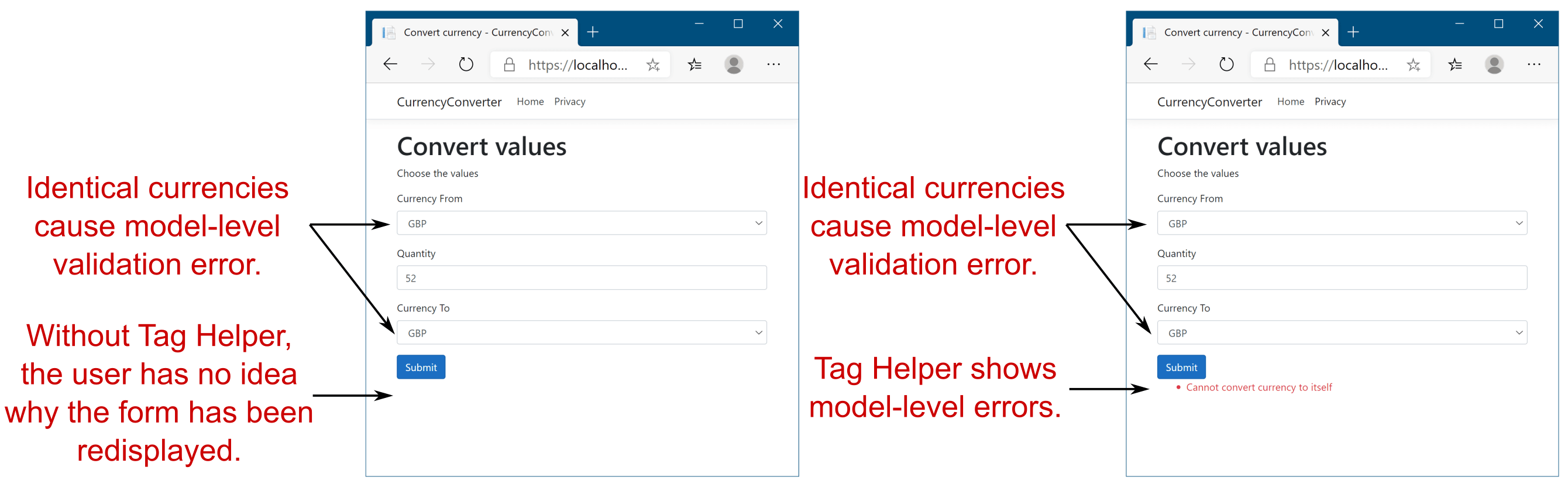
Figure 18.10 Model-level errors are only displayed by the Validation Summary Tag Helper. Without one, users won’t have any indication that there were errors on the form and so won’t be able to correct them.
图 18.10 模型级错误仅由 Validation Summary Tag Helper 显示。如果没有 ID,用户将不会有任何迹象表明表单上存在错误,因此无法更正它们。
NOTE For simplicity, I added the validation check to the page handler. An alternative approach would be to create a custom validation attribute or use IValidatableObject (described in chapter 7). That way, your handler stays lean and sticks to the single- responsibility principle (SRP). You’ll see how to create a custom validation attribute in chapter 32.
注意:为简单起见,我将验证检查添加到页面处理程序中。另一种方法是创建自定义验证属性或使用 IValidatableObject(如第 7 章所述)。这样,您的处理人员就会保持精简并坚持单一责任原则 (SRP)。您将在第 32 章中了解如何创建自定义验证属性。
This section covered most of the common Tag Helpers available for working with forms, including all the pieces you need to build the currency converter forms. They should give you everything you need to get started building forms in your own applications. But forms aren’t the only area in which Tag Helpers are useful; they’re generally applicable any time you need to mix server-side logic with HTML generation.
本节介绍了可用于表单的大多数常见 Tag Helper,包括构建货币转换器表单所需的所有部分。它们应该为您提供开始在您自己的应用程序中构建表单所需的一切。但是,表单并不是 Tag Helpers 唯一有用的领域;它们通常适用于您需要将服务器端逻辑与 HTML 生成混合的任何时间。
One such example is generating links to other pages in your application using routing-based URL generation. Given that routing is designed to be fluid as you refactor your application, keeping track of the exact URLs the links should point to would be a bit of a maintenance nightmare if you had to do it by hand. As you might expect, there’s a Tag Helper for that: the Anchor Tag Helper.
一个这样的示例是使用基于路由的 URL 生成生成指向应用程序中其他页面的链接。鉴于路由设计为在重构应用程序时是流畅的,因此如果必须手动跟踪链接应指向的确切 URL,那将有点像维护的噩梦。如您所料,有一个 Tag Helper 可用于此:Anchor Tag Helper。
18.3 Generating links with the Anchor Tag Helper
18.3 使用 Anchor Tag Helper 生成链接
In chapters 6 and 15, I showed how you could generate URLs for links to other pages in your application using LinkGenerator and IUrlHelper. Views are another common place where you need to generate links, normally by way of an <a> element with an href attribute pointing to the appropriate URL.
在第 6 章和第 15 章中,我演示了如何使用 LinkGenerator 和 IUrlHelper 为指向应用程序中其他页面的链接生成 URL。视图是另一个需要生成链接的常见位置,通常是通过具有 href 属性的<a>元素指向相应的 URL。
In this section I show how you can use the Anchor Tag Helper to generate the URL for a given Razor Page using routing. Conceptually, this is almost identical to the way the Form Tag Helper generates the action URL, as you saw in section 18.2.1. For the most part, using the Anchor Tag Helper is identical too; you provide asp-page and asp-page-handler attributes, along with asp-route- attributes as necessary. The default Razor Page templates use the Anchor Tag Helper to generate the links shown in the navigation bar using the code in the following listing.
在本节中,我将介绍如何使用 Anchor Tag Helper 通过路由为给定的 Razor Page 生成 URL。从概念上讲,这与 Form Tag Helper 生成作 URL 的方式几乎相同,如您在第 18.2.1 节中看到的那样。在大多数情况下,使用 Anchor Tag Helper 也是相同的;根据需要提供 asp-page 和 asp-page-handler 属性以及 asp-route- 属性。默认的 Razor 页面模板使用 Anchor Tag Helper 使用以下清单中的代码生成导航栏中显示的链接。
Listing 18.9 Using the Anchor Tag Helper to generate URLs in _Layout.cshtml
列表 18.9 使用 Anchor 标记帮助程序在 _Layout.cshtml 中生成 URL
<ul class="navbar-nav flex-grow-1">
    <li class="nav-item">
        <a class="nav-link text-dark"
            asp-area="" asp-page="/Index">Home</a>
    </li>
    <li class="nav-item">
        <a class="nav-link text-dark"
            asp-area="" asp-page="/Privacy">Privacy</a>
    </li>
</ul>
As you can see, each <a> element has an asp-page attribute. This Tag Helper uses the routing system to generate an appropriate URL for the <a>, resulting in the following markup:
如您所见,每个<a> 元素都有一个 asp-page 属性。此 Tag Helper 使用路由系统为<a> 生成适当的 URL,从而生成以下标记:
<ul class="nav navbar-nav">
    <li class="nav-item">
        <a class="nav-link text-dark" href="/">Home</a>
    </li>
    <li class="nav-item">
        <a class="nav-link text-dark" href="/Privacy">Privacy</a>
    </li>t
</ul>
The URLs use default values where possible, so the Index Razor Page generates the simple "/" URL instead of "/Index".
URL 会尽可能使用默认值,因此索引 Razor 页面会生成简单的“/”URL,而不是“/Index”。
If you need more control over the URL generated, the Anchor Tag Helper exposes several additional properties you can set, which are during URL generation. The attributes most often used with Razor Pages are
如果您需要对生成的 URL 进行更多控制,则 Anchor Tag Helper 会公开您可以设置的几个其他属性,这些属性在 URL 生成期间进行。Razor Pages 最常用的属性是
• asp-page—Sets the Razor Page to execute.
asp-page - 设置要执行的 Razor 页面。
• asp-page-handler—Sets the Razor Page handler to execute.
asp-page-handler - 设置要执行的 Razor Page 处理程序。
• asp-area—Sets the area route parameter to use. Areas can be used to provide an additional layer of organization to your application.[1]
asp-area - 设置要使用的区域路由参数。区域可用于为应用程序提供额外的组织层。[1]
• asp-host—If set, the generated link points to the provided host and generates an absolute URL instead of a relative URL.
asp-host - 如果设置,则生成的链接将指向提供的主机,并生成绝对 URL 而不是相对 URL。
• asp-protocol—Sets whether to generate an http or https link. If set, it generates an absolute URL instead of a relative URL.
asp-protocol - 设置是生成 http 还是 https 链接。如果设置,它将生成绝对 URL 而不是相对 URL。
• asp-route-—Sets the route parameters to use during generation. Can be added multiple times for different route parameters.
asp-route- - 设置生成过程中要使用的路由参数。可以为不同的路由参数多次添加。
By using the Anchor Tag Helper and its attributes, you generate your URLs using the routing system, as described in chapters 5 and 14. This reduces the duplication in your code by removing the hardcoded URLs you’d otherwise need to embed in all your views.
通过使用 Anchor Tag Helper 及其属性,您可以使用路由系统生成 URL,如第 5 章和第 14 章所述。这通过删除您需要嵌入到所有视图中的硬编码 URL 来减少代码中的重复。
If you find yourself writing repetitive code in your markup, chances are someone has written a Tag Helper to help with it. The Append Version Tag Helper in the following section is a great example of using Tag Helpers to reduce the amount of fiddly code required.
如果您发现自己在标记中编写了重复的代码,则很可能有人编写了 Tag Helper 来帮助处理它。以下部分中的 Append Version Tag Helper 是使用 Tag Helpers 减少所需繁琐代码量的一个很好的示例。
18.4 Cache-busting with the Append Version Tag Helper
18.4 使用 Append Version Tag Helper 进行缓存无效化
A common problem with web development, both when developing and when an application goes into production, is ensuring that browsers are all using the latest files. For performance reasons, browsers often cache files locally and reuse them for subsequent requests rather than calling your application every time a file is requested.
Web 开发的一个常见问题,无论是在开发时还是在应用程序投入生产时,都是确保浏览器都使用最新的文件。出于性能原因,浏览器通常会在本地缓存文件,并在后续请求中重复使用它们,而不是在每次请求文件时都调用应用程序。
Normally, this is great. Most of the static assets in your site rarely change, so caching them significantly reduces the burden on your server. Think of an image of your company logo. How often does that change? If every page shows your logo, caching the image in the browser makes a lot of sense.
通常,这很好。您网站中的大多数静态资源很少更改,因此缓存它们可以显著减轻服务器的负担。想想您公司徽标的图像。这种情况多久改变一次?如果每个页面都显示您的 logo,那么在浏览器中缓存图像就很有意义。
But what happens if it does change? You want to make sure users get the updated assets as soon as they’re available. A more critical requirement might be if the JavaScript files associated with your site change. If users end up using cached versions of your JavaScript, they might see strange errors, or your application might appear broken to them.
但是,如果它真的发生了变化,会发生什么呢?您希望确保用户在更新的资产可用时立即获得更新的资产。更关键的要求可能是与您的网站关联的 JavaScript 文件是否发生更改。如果用户最终使用您的 JavaScript 的缓存版本,他们可能会看到奇怪的错误,或者您的应用程序可能会对他们造成破坏。
This conundrum is a common one in web development, and one of the most common ways for handling it is to use a cache-busting query string.
这个难题在 Web 开发中很常见,最常见的处理方法之一是使用缓存清除查询字符串。
DEFINITION A cache-busting query string adds a query parameter to a URL, such as ?v=1. Browsers will cache the response and use it for subsequent requests to the URL. When the resource changes, the query string is also changed, such as to ?v=2. Browsers will see this as a request for a new resource and make a fresh request.
定义:缓存无效化查询字符串会将查询参数添加到 URL,例如 ?v=1。浏览器将缓存响应并将其用于对 URL 的后续请求。当资源更改时,查询字符串也会更改,例如 ?v=2。浏览器会将此视为对新资源的请求,并发出新的请求。
The biggest problem with this approach is that it requires you to update a URL every time an image, CSS, or JavaScript file changes. This is a manual step that requires updating every place the resource is referenced, so it’s inevitable that mistakes are made. Tag Helpers to the rescue! When you add a <script>, <img>, or <link> element to your application, you can use Tag Helpers to automatically generate a cache-busting query string:
这种方法的最大问题是,它要求您在每次图像、CSS 或 JavaScript 文件更改时更新 URL。这是一个手动步骤,需要更新引用资源的每个位置,因此不可避免地会犯错误。标记助手来救援!当您向应用程序添加 <script>, <img>或 <link>元素时,您可以使用 Tag Helpers 自动生成缓存无效化查询字符串:
<script src="~/js/site.js" asp-append-version="true"></script>The asp-append-version attribute will load the file being referenced and generate a unique hash based on its contents. This is then appended as a unique query string to the resource URL:
asp-append-version 属性将加载被引用的文件,并根据其内容生成唯一的哈希值。然后,将其作为唯一查询字符串附加到资源 URL:
<script src="/js/site.js?v=EWaMeWsJBYWmL2g_KkgXZQ5nPe"></script>As this value is a hash of the file contents, it remains unchanged as long as the file isn’t modified, so the file will be cached in users’ browsers. But if the file is modified, the hash of the contents changes and so does the query string. This ensures that browsers are always served the most up-to-date files for your application without your having to worry about updating every URL manually whenever you change a file.
由于此值是文件内容的哈希值,因此只要文件未被修改,它就会保持不变,因此该文件将缓存在用户的浏览器中。但是,如果文件被修改,内容的哈希值会发生变化,查询字符串也会发生变化。这可确保浏览器始终为您的应用程序提供最新的文件,而不必担心在更改文件时手动更新每个 URL。
So far in this chapter you’ve seen how to use Tag Helpers for forms, link generation, and cache busting. You can also use Tag Helpers to conditionally render different markup depending on the current environment. This uses a technique you haven’t seen yet, where the Tag Helper is declared as a completely separate element.
到目前为止,在本章中,您已经了解了如何使用标签帮助程序进行表单、链接生成和缓存无效化。您还可以使用 Tag Helpers 根据当前环境有条件地呈现不同的标记。这使用了一种你还没见过的技术,其中 Tag Helper 被声明为一个完全独立的元素。
18.5 Using conditional markup with the Environment Tag Helper
18.5 将条件标记与环境标记帮助程序一起使用
In many cases, you want to render different HTML in your Razor templates depending on whether your website is running in a development or production environment. For example, in development you typically want your JavaScript and CSS assets to be verbose and easy to read, but in production you’d process these files to make them as small as possible. Another example might be the desire to apply a banner to the application when it’s running in a testing environment, which is removed when you move to production, as shown in figure 18.11.
在许多情况下,您希望在 Razor 模板中呈现不同的 HTML,具体取决于您的网站是在开发环境中运行还是在生产环境中运行。例如,在开发中,您通常希望 JavaScript 和 CSS 资源冗长且易于阅读,但在生产环境中,您需要处理这些文件以使其尽可能小。另一个示例可能是希望在应用程序在测试环境中运行时向应用程序应用横幅,当您移动到生产环境时,该横幅将被删除,如图 18.11 所示。
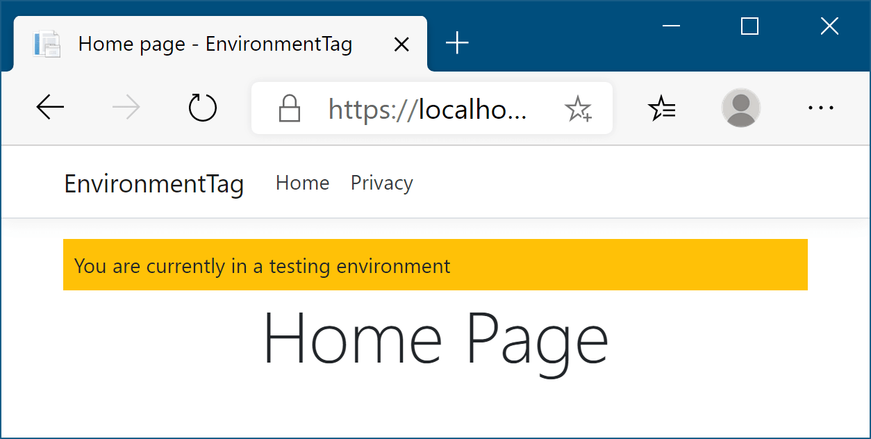
Figure 18.11 The warning banner will be shown whenever you’re running in a testing environment, to make it easy to distinguish from production.
图 18.11 当您在测试环境中运行时,都会显示警告横幅,以便于与生产区分开来。
You’ve already seen how to use C# to add if statements to your markup, so it would be perfectly possible to use this technique to add an extra div to your markup when the current environment has a given value. If we assume that the env variable contains the current environment, you could use something like this:
您已经了解了如何使用 C# 将 if 语句添加到标记中,因此当当前环境具有给定值时,完全可以使用此技术向标记中添加额外的 div。如果我们假设 env 变量包含当前环境,则可以使用如下内容:
@if(env == "Testing" || env == "Staging")
{
    <div class="warning">You are currently on a testing environment</div>
}
There’s nothing wrong with this, but a better approach would be to use the Tag Helper paradigm to keep your markup clean and easy to read. Luckily, ASP.NET Core comes with the EnvironmentTagHelper, which can be used to achieve the same result in a slightly clearer way:
这没有错,但更好的方法是使用 Tag Helper 范例来保持标记干净且易于阅读。幸运的是,ASP.NET Core 附带了 EnvironmentTagHelper,它可用于以更清晰的方式实现相同的结果:
<environment include="Testing,Staging">
    <div class="warning">You are currently on a testing environment</div>
</environment>
This Tag Helper is a little different from the others you’ve seen before. Instead of augmenting an existing HTML element using an asp- attribute, the whole element is the Tag Helper. This Tag Helper is completely responsible for generating the markup, and it uses an attribute to configure it.
此 Tag Helper 与您以前见过的其他 Tag Helper 略有不同。整个元素不是使用 asp- 属性来扩充现有的 HTML 元素,而是 Tag Helper。此 Tag Helper 完全负责生成标记,并使用属性对其进行配置。
Functionally, this Tag Helper is identical to the C# markup (where the env variable contains the hosting environment, as described in chapter 10), but it’s more declarative in its function than the C# alternative. You’re obviously free to use either approach, but personally I like the HTML-like nature of Tag Helpers.
从功能上讲,此 Tag Helper 与 C# 标记相同(其中 env 变量包含托管环境,如第 10 章所述),但它的函数比 C# 替代方案更具声明性。显然,您可以自由使用任何一种方法,但就个人而言,我喜欢 Tag Helper 的类似 HTML 的性质。
We’ve reached the end of this chapter on Tag Helpers, and with it, we’ve finished our main look at building traditional web applications that display HTML to users. In the last part of the book, we’ll revisit Razor templates when you learn how to build custom components like custom Tag Helpers and view components. For now, you have everything you need to build complex Razor layouts; the custom components can help tidy up your code down the line.
我们已经完成了本章关于标记帮助程序的结尾,这样,我们已经完成了构建向用户显示 HTML 的传统 Web 应用程序的主要内容。在本书的最后一部分,当您学习如何构建自定义组件(如自定义标记帮助程序)和视图组件时,我们将重新访问 Razor 模板。目前,您拥有构建复杂 Razor 布局所需的一切;自定义组件可以帮助整理您的代码。
Part 3 of this book has been a whistle-stop tour of how to build Razor Page applications with ASP.NET Core. You now have the basic building blocks to start making server-rendered ASP.NET Core applications. Before we move on to discussing security in part 4 of this book, I’ll take a couple of chapters to discuss building apps with MVC controllers.
本书的第 3 部分简要介绍了如何使用 ASP.NET Core 构建 Razor Page 应用程序。现在,您拥有了开始制作服务器渲染的 ASP.NET Core 应用程序的基本构建块。在我们继续讨论本书的第 4 部分的安全性之前,我将用几章来讨论使用 MVC 控制器构建应用程序。
I’ve talked about MVC controllers a lot in passing, but in chapter 19 you’ll learn why I recommend Razor Pages over MVC controllers for server-rendered apps. Nevertheless, there are some situations for which MVC controllers make sense.
我顺便谈了很多 MVC 控制器,但在第 19 章中,您将了解为什么我建议将 Razor Pages 用于服务器渲染的应用程序,而不是 MVC 控制器。尽管如此,在某些情况下,MVC 控制器是有意义的。
18.6 Summary
18.6 总结
With Tag Helpers, you can bind your data model to HTML elements, making it easier to generate dynamic HTML while remaining editor friendly.
使用标记帮助程序,您可以将数据模型绑定到 HTML 元素,从而更轻松地生成动态 HTML,同时保持编辑器友好性。
As with Razor in general, Tag Helpers are for server-side rendering of HTML only. You can’t use them directly in frontend frameworks, such as Angular or React.
与一般的 Razor 一样,标记帮助程序仅用于 HTML 的服务器端呈现。您不能直接在前端框架(如 Angular 或 React)中使用它们。
Tag Helpers can be standalone elements or can attach to existing HTML using attributes. This lets you both customize HTML elements and add entirely new elements.
标记帮助程序可以是独立元素,也可以使用属性附加到现有 HTML。这样,您既可以自定义 HTML 元素,也可以添加全新的元素。
Tag Helpers can customize the elements they’re attached to, add additional attributes, and customize how they’re rendered to HTML. This can greatly reduce the amount of markup you need to write.
标记帮助程序可以自定义它们所附加到的元素,添加其他属性,并自定义它们呈现为 HTML 的方式。这可以大大减少您需要编写的标记量。
Tag Helpers can expose multiple attributes on a single element. This makes it easier to configure the Tag Helper, as you can set multiple, separate values.
标记帮助程序可以在单个元素上公开多个属性。这使得配置 Tag Helper 变得更加容易,因为您可以设置多个单独的值。
You can add the asp-page and asp-page-handler attributes to the <form> element to set the action URL using the URL generation feature of Razor Pages.
可以将 asp-page 和 asp-page-handler 属性添加到<form>元素,以使用 Razor Pages 的 URL 生成功能设置作 URL。
You specify route values to use during routing with the Form Tag Helper using asp-route- attributes. These values are used to build the final URL or are passed as query data.
使用 asp-route- 属性通过表单标记帮助程序指定要在路由期间使用的路由值。这些值用于构建最终 URL 或作为查询数据传递。
The Form Tag Helper also generates a hidden field that you can use to prevent CSRF attacks. This is added automatically and is an important security measure.
Form Tag Helper 还会生成一个隐藏字段,您可以使用它来防止 CSRF 攻击。这是自动添加的,是一项重要的安全措施。
You can attach the Label Tag Helper to a <label> using asp-for. It generates an appropriate for attribute and caption based on the [Display] DataAnnotation attribute and the PageModel property name.
您可以将 Label Tag Helper 附加到<label> 使用 asp-for.它根据 [Display] DataAnnotation 属性和 PageModel 属性名称生成相应的属性和标题。
The Input Tag Helper sets the type attribute of an <input> element to the appropriate value based on a bound property’s Type and any DataAnnotation attributes applied to it. It also generates the data-val- attributes required for client-side validation. This significantly reduces the amount of HTML code you need to write.
Input Tag Helper 根据绑定属性的 Type 和应用于它的任何 DataAnnotation 属性,将 <input>元素的 type 属性设置为适当的值。它还生成客户端验证所需的 data-val- 属性。这大大减少了您需要编写的 HTML 代码量。
To enable client-side validation, you must add the necessary JavaScript files to your view for jQuery validation and unobtrusive validation.
要启用客户端验证,您必须将必要的 JavaScript 文件添加到视图中,以进行 jQuery 验证和不引人注目的验证。
The Select Tag Helper can generate drop-down <select> elements as well as list boxes, using the asp-for and asp-items attributes. To generate a multiselect <select> element, bind the element to an IEnumerable property on the view model. You can use these approaches to generate several different styles of select box.
Select Tag Helper 可以使用 asp-for 和 asp-items 属性生成下拉<select>元素和列表框。要生成多选元素,请将该<select>元素绑定到视图模型上的 IEnumerable 属性。您可以使用这些方法生成多种不同样式的选择框。
You can generate an IEnumerable<SelectListItem> for an enum TEnum using the Html.GetEnumSelectList<TEnum>() helper method. This saves you having to write the mapping code yourself.
您可以使用 helper Html.GetEnumSelectList<TEnum>() 方法生成 IEnumerable<SelectListItem> 枚举 TEnum。这样就不必自己编写映射代码。
The Select Tag Helper generates <optgroup> elements if the items supplied in asp-for have an associated SelectListGroup on the Group property. Groups can be used to separate items in select lists.
如果 asp-for 中提供的项在 Group 属性上具有关联的 SelectListGroup,则 Select Tag Helper 会生成<optgroup> 元素。组可用于分隔选择列表中的项目。
Any extra additional <option> elements added to the Razor markup are passed through to the final HTML unchanged. You can use these additional elements to easily add a “no selection” option to the <select> element.
添加到 Razor 标记的任何其他额外<option>元素都将原封不动地传递到最终 HTML。您可以使用这些附加元素轻松地向 <select>元素添加“无选择”选项。
The Validation Message Tag Helper is used to render the client- and server-side validation error messages for a given property. This gives important feedback to your users when elements have errors. Use the asp-validation-for attribute to attach the Validation Message Tag Helper to a <span>.
验证消息标记帮助程序用于呈现给定属性的客户端和服务器端验证错误消息。当元素有错误时,这会向用户提供重要的反馈。使用 asp-validation-for 属性将验证消息标记帮助程序附加到<span> .
The Validation Summary Tag Helper displays validation errors for the model, as well as for individual properties. You can use model-level properties to display additional validation that doesn’t apply to just one property. Use the asp-validation-summary attribute to attach the Validation Summary Tag Helper to a <div>.
Validation Summary Tag Helper 显示模型以及各个属性的验证错误。您可以使用模型级属性来显示不仅适用于一个属性的其他验证。使用 asp-validation-summary 属性将验证摘要标记帮助程序附加到 <div>.
You can generate <a> URLs using the Anchor Tag Helper. This helper uses routing to generate the href URL using asp-page, asp-page-handler, and asp-route- attributes, giving you the full power of routing.
您可以使用 Anchor Tag Helper 生成<a> URL。此帮助程序使用路由通过 asp-page、asp-page-handler 和 asp-route- 属性生成 href URL,从而为您提供完整的路由功能。
You can add the asp-append-version attribute to <link>, <script>, and <img> elements to provide cache-busting capabilities based on the file’s contents. This ensures users cache files for performance reasons, yet still always get the latest version of files.
您可以将 asp-append-version 属性添加到 <link>, <script> 和 <img>元素中,以根据文件的内容提供缓存清除功能。这可确保用户出于性能原因缓存文件,但仍始终获得最新版本的文件。
You can use the Environment Tag Helper to conditionally render different HTML based on the app’s current execution environment. You can use this to render completely different HTML in different environments if you wish.
您可以使用 Environment Tag Helper 根据应用程序的当前执行环境有条件地呈现不同的 HTML。如果你愿意,你可以使用它来在不同的环境中呈现完全不同的 HTML。
[1] I don’t cover areas in detail in this book. They’re an optional aspect of MVC that are often only used on large projects. You can read about them here: http://mng.bz/3X64.
[1] 我在这本书中没有详细介绍各个领域。它们是 MVC 的一个可选方面,通常仅用于大型项目。您可以在此处阅读有关它们的信息:http://mng.bz/3X64。